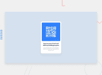
Design comparison
Solution retrospective
I honed my design skills using css and HTML, It was fun designing a card, I learnt new tricks, I would plan better next time before execution and building.
What challenges did you encounter, and how did you overcome them?I faced challenges in designing the card for small (mobile) devices. I didn't overcome them in this project but maybe in the next project I will be able to solve them.
What specific areas of your project would you like help with?I would like help in designing the card for small(mobile devices).
Community feedback
- @jotaprojectsPosted 8 months ago
Nice work!
I got some tips for you. You can let the body element (with flex-box) center the card element instead of using
position: absolute;. But there are always multiple ways of centering an element.I would also think about the image here. From what I saw you can remove the hard coded height and width and set only one
max-width: 100%;on the image tag. I also removed height and max-width on the card element. This I would do to make it work with the content instead of follow the design.For me images are tricky to get responsive. I hope you test and try out!
0
Please log in to post a comment
Log in with GitHubJoin our Discord community
Join thousands of Frontend Mentor community members taking the challenges, sharing resources, helping each other, and chatting about all things front-end!
Join our Discord

