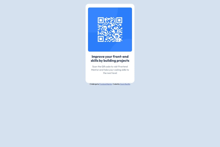
Design comparison
Solution retrospective
I learned a lot about various CSS elements and how to include multiple font weights when importing a font from the Google API.
What specific areas of your project would you like help with?I'm still a little unsure about the positioning of the card in the screen.
Community feedback
- @StroudyPosted about 2 months ago
Exceptional work! You’re showing great skill here. I’ve got a couple of minor suggestions that could make this stand out even more…
-
Using a full modern CSS reset is beneficial because it removes default browser styling, creating a consistent starting point for your design across all browsers. It helps avoid unexpected layout issues and makes your styles more predictable, ensuring a uniform appearance on different devices and platforms, check out this site for a Full modern reset
-
For future project, You could download and host your own fonts using
@font-face
improves website performance by reducing external requests, provides more control over font usage, ensures consistency across browsers, enhances offline availability, and avoids potential issues if third-party font services become unavailable. Place to get .woff2 fonts -
While
px
is useful for precise, fixed sizing, such asborder-width
,border-radius
,inline-padding
, and<img>
sizes, it has limitations. Pixels don't scale well with user settings or adapt to different devices, which can negatively impact accessibility and responsiveness. For example, usingpx
for font sizes can make text harder to read on some screens, Check this article why font-size must NEVER be in pixels. In contrast, relative units likerem
and adjust based on the user’s preferences and device settings, making your design more flexible and accessible. Usepx
where exact sizing is needed, but prefer relative units for scalable layouts. If you want a deeper explanation watch this video by Kevin Powell CSS em and rem explained. Another great resource I found useful is this px to rem converter based on the default font-size of 16 pixel. -
Line height is usually unitless to scale proportionally with the font size, keeping text readable across different devices. Best practice is to use a unitless value like
1.5
for flexibility. Avoid using fixed units likepx
or%
, as they don't adapt well to changes in font size or layout.
I hope you’re finding this guidance useful! Keep refining your skills and tackling new challenges with confidence. You’re making great progress—stay motivated and keep coding with enthusiasm! 💻
0 -
- @Illia-LPosted about 2 months ago
Consider meaningful tags and class names for the following:
- div.content -> section.qr-section;
- div.text -> div.qr-data;
- div.text-preset-1 -> div.qr-title;
- div.text-preset-2 -> div.qr-description;
Some sizes differ from design:
- the component is not centered verticaly;
- component is bigger;
- the card visually has different top and side paddings.
0@gjrestifoPosted about 2 months ago@Illia-L Any advice on how to ensure my components are the same size as the original design? I tried to take the height and width measurements straight from the Figma file, but clearly that didn't work properly.
0 - @MohammedOnGitPosted about 2 months ago
Hello gjrestifo!!!
Your HTML structure looks well-organized and simple for the QR code component. Below are a few suggestions for improvement:
- Accessibility Enhancements Ensure the alt text for the QR code image is descriptive. It should explain the purpose of the image to users who may be using screen readers. Example:
<img src="images/image-qr-code.png" alt="QR code to visit Frontend Mentor website" />
- SEO & Meta Description Add a meta description to improve SEO and provide more context for users and search engines:
<meta name="description" content="QR code component built for the Frontend Mentor challenge. Scan the QR code to enhance your front-end skills with hands-on projects."> I hope this helps. You did great. Keep it up.
0
Please log in to post a comment
Log in with GitHubJoin our Discord community
Join thousands of Frontend Mentor community members taking the challenges, sharing resources, helping each other, and chatting about all things front-end!
Join our Discord