Design comparison
Solution retrospective
Look at my code and tell me what I have to improve to make my code professional and other developers can easily understand my code
Community feedback
- @masahxPosted about 1 year ago
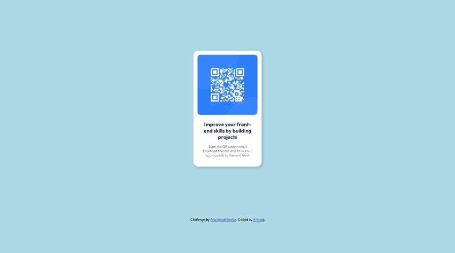
it's smaller than original design and not same background color? code looks OK to me, I'm not some big expert, nice that you used shadow, I escaped it. I put flex everywhere, your is simpler, I like that
Marked as helpful1@Ahmadhassan0Posted about 1 year ago@masahx Thanks for your valuable feedback
Oh, I forgot to change the background color, when I was comparing my component with the sample at that time there was a small difference but after submitting it don't know why the difference is huge🤔😄
1@masahxPosted about 1 year ago@Ahmadhassan0 I don't know exactly, maybe something with relative sizes, image is a bit smaller than in the design. Your page shrinks-grows with changing of screen width. maybe not important, but if you want to follow specification strictly
Marked as helpful1 - @Ahmadhassan0Posted about 1 year ago
Yes, you're right, I noticed it's happened because of "%" and "vw" unit if I used "rem" insted of this the problem would have been solved
1
Please log in to post a comment
Log in with GitHubJoin our Discord community
Join thousands of Frontend Mentor community members taking the challenges, sharing resources, helping each other, and chatting about all things front-end!
Join our Discord
