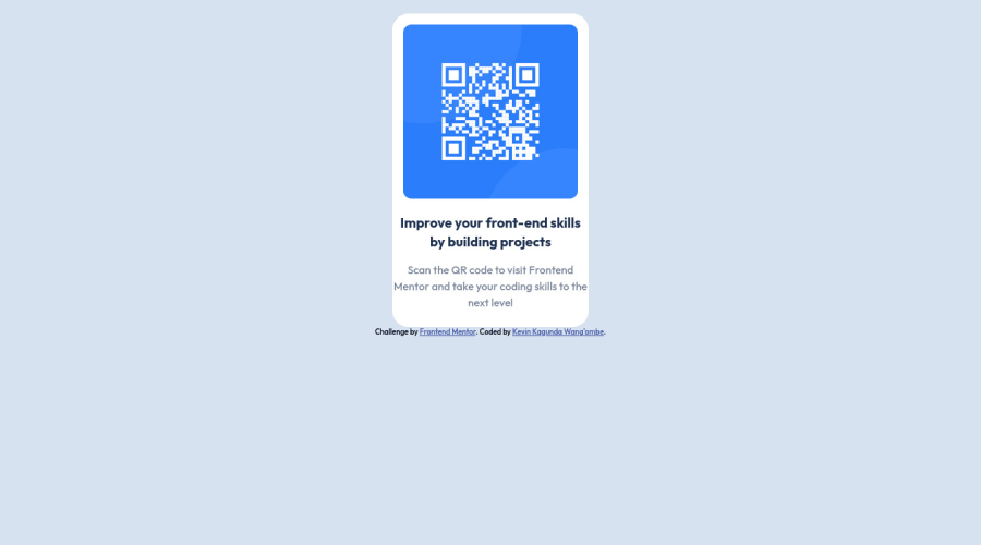
Design comparison
Solution retrospective
Hello! All Feedback are welcomed.
Community feedback
- @smarko-webPosted almost 2 years ago
Congratulations on your first project!
Some improvements
- Adding landing marks I.e
mainandfooter - You don’t really need to give everything a class name, just target by elements
- Use flexbox where you have
container - Centralize the card by
css main {display: flex; justify-content: center; align-items:: center;} - Needs some improvement for mobile (although not bad for starters)
What I like
- Good UI
- Your effort
Keep up the good work, stay motivated
Marked as helpful1@kevinwangombePosted almost 2 years ago@smarko-web Thanks a lot, and will definitely change it.
0 - Adding landing marks I.e
- @HassiaiPosted almost 2 years ago
Replace <div class="container back-bone"> with the main tag and <div class="attribution"> with the footer tag to fix the accessibility issues. for more on semantic html visit https://web.dev/learn/html/semantic-html/
To center a content on a page, add min-height:100vh; to the body and remove the height value.
Give h1 and p the same padding-left and padding-right values.
Hope am helpful
Well done for completing this challenge. HAPPY CODING
Marked as helpful1
Please log in to post a comment
Log in with GitHubJoin our Discord community
Join thousands of Frontend Mentor community members taking the challenges, sharing resources, helping each other, and chatting about all things front-end!
Join our Discord
