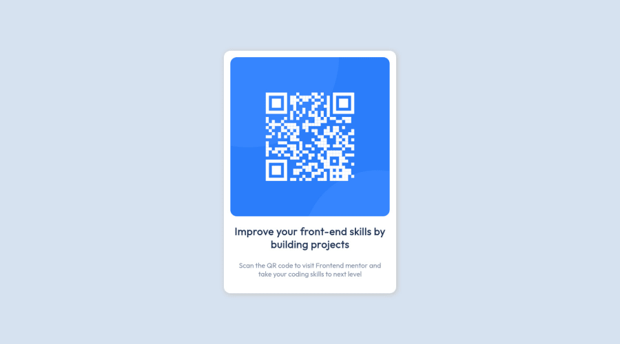
QR code component - Fully Responsive - Modern Css (vmin - clamp)
Design comparison
Community feedback
- @MelvinAguilarPosted over 1 year ago
Hello there 👋. Good job on completing the challenge !
I have one suggestions about your code that might interest you.
-
Use
min-height: 100vhinstead ofheight. Setting the height to 100vh may result in the component being cut off on smaller screens, such as a mobile phone in landscape orientation.I have a theory and it is that is why you have removed the title and the paragraph in (max-height: 300px), but I have a small opinion. People who see it on a mobile device in landscape orientation will only see the image without any context, while people who see it on a desktop device will see all the text. It is not very comfortable, it is my humble opinion.
I hope you find it useful! 😄 Above all, the solution you submitted is great!
Happy coding!
Marked as helpful1@robicode-05Posted over 1 year ago@MelvinAguilar
Hello,
Thanks for the feedback! I will be careful to use the min-height instead of the height !
Concerning the disappearance of texts, personally I liked it, but indeed in case of a mobile in landscape mode, it's true that it will be disturbing to have nothing as a context.
In the future, I would try to solve the mobile display problems with a better approach : D
0 -
Please log in to post a comment
Log in with GitHubJoin our Discord community
Join thousands of Frontend Mentor community members taking the challenges, sharing resources, helping each other, and chatting about all things front-end!
Join our Discord
