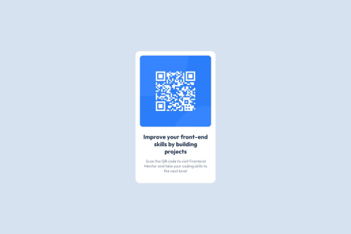
QR Code Component | Frontend Mentor

Solution retrospective
For my project, I'm most proud of the functionality I was able to implement and the way the final product turned out. Seeing everything come together after all the hard work was incredibly satisfying. I learned a lot about problem-solving and how to overcome unexpected challenges, especially when it came to debugging and optimizing the code.
If I could do something differently next time, I would:
- Focus more on planning and documentation from the start. I realized that having a more detailed plan and keeping better records of my decisions would have saved time and made the development process smoother.
For this project, I didn’t encounter any significant challenges since the task was relatively straightforward. The ease of the project allowed me to focus more on refining my CSS skills and paying attention to the details, like ensuring the layout was pixel-perfect and responsive.
While there weren’t any major hurdles, I did take the opportunity to experiment with different CSS properties and layouts. This exploration helped me solidify my understanding of CSS, and I feel more confident in my ability to tackle more complex projects in the future.
What specific areas of your project would you like help with?Since the QR Code Component project was fairly simple and I didn't face any major challenges, I don't need much help with this particular project. However, I’m always looking for ways to improve and would appreciate feedback on:
- Code Optimization: Are there any areas where I could streamline my HTML or CSS for better performance or cleaner code?
- Best Practices: Did I follow best practices in terms of structure, semantics, and accessibility? Any tips on improving in these areas would be helpful.
- Design Enhancements: Are there any subtle design improvements I could make to enhance the user experience or visual appeal?
Getting insights on these aspects would help me refine my approach in future projects.
Please log in to post a comment
Log in with GitHubCommunity feedback
No feedback yet. Be the first to give feedback on ttvclvckPWNERS's solution.
Join our Discord community
Join thousands of Frontend Mentor community members taking the challenges, sharing resources, helping each other, and chatting about all things front-end!
Join our Discord