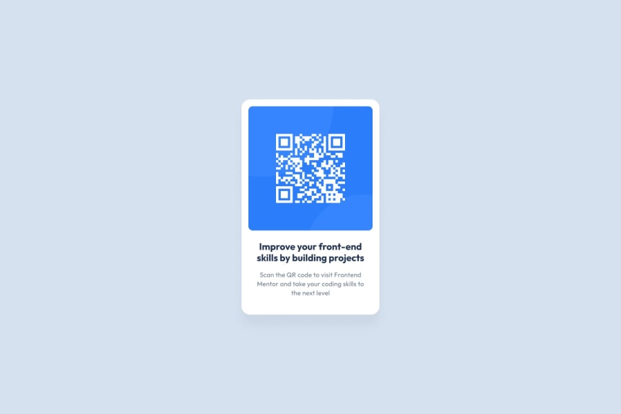
QR-code-component-Frontend-Mentor
Design comparison
Community feedback
- @StroudyPosted about 2 months ago
Awesome job tackling this challenge! You’re doing amazing, and I wanted to share a couple of suggestions that might help refine your approach…
-
Using a
<main>tag inside the<body>of your HTML is a best practice because it clearly identifies the main content of your page. This helps with accessibility and improves how search engines understand your content. -
Developers should avoid using pixels (
px) because they are a fixed size and don't scale well on different devices. Instead, useremorem, which are relative units that adjust based on user settings, making your design more flexible, responsive, and accessible. For more information check out this, Why font-size must NEVER be in pixels or this video by Kevin Powell CSS em and rem explained.- Another great resource for px to rem converter. -
Using
max-width: 100%ormin-width: 100%is more responsive than justwidth: 100%because they allow elements to adjust better to different screen sizes. To learn more, check out this article: responsive-meaning. -
For future project, You could downloading and host your own fonts using
@font-faceimproves website performance by reducing external requests, provides more control over font usage, ensures consistency across browsers, enhances offline availability, and avoids potential issues if third-party font services become unavailable. Place to get .woff2 fonts
You’re doing fantastic! I hope these tips help you as you continue your coding journey. Stay curious and keep experimenting—every challenge is an opportunity to learn. Have fun, and keep coding with confidence! 🌟
0 -
- @Kalo-GreenPosted about 2 months ago
Hello,
I recommend replacing the <h2> with a <h1> to improve the semantics and accessibility of your code. The <h1> is generally used for the main title of a page, allowing screen readers and search engines to better understand the structure of your content.
In addition, to respect the color palette of the layout, I advise you to use the color hsl(218, 44%, 22%) for the <h1>, which will ensure good readability and visual harmony. For the paragraph, the color hsl(216, 15%, 48%) is recommended to maintain graphic consistency and enhance the user experience.
Happy coding !
0
Please log in to post a comment
Log in with GitHubJoin our Discord community
Join thousands of Frontend Mentor community members taking the challenges, sharing resources, helping each other, and chatting about all things front-end!
Join our Discord
