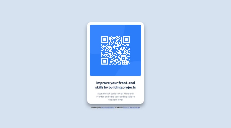
Design comparison
Solution retrospective
I figured out that all the spacing and paddings required can be taken from figma which I didn't knew before. Next time, I want to focus on how figure out the padding and margins if the design is given in a jpg or ant other format
What challenges did you encounter, and how did you overcome them?I have encountered challenges for the responsiveness of the page, I figured it by surfing through w3schools
What specific areas of your project would you like help with?How to know exact padding and margins as of the design? What are the breakpoints that need to be given to make the page responsive? How can we minimize code redundancy?
Community feedback
- @sivaprasath2004Posted 7 months ago
Hello i`m wishing for your completion in this project.
- I will be see in your code
- HTML to include a challenge and the author's name, must be in footer this is easy align and that is end of the content.
- you will be use
<div class="attribution"> Challenge by <a href="https://www.frontendmentor.io?ref=challenge" target="_blank">Frontend Mentor</a>. Coded by <a href="#">Tharun Theja Boyalla</a>. </div>
- change to
<footer> <div class="attribution"> Challenge by <a href="https://www.frontendmentor.io?ref=challenge" target="_blank">Frontend Mentor</a>. Coded by <a href="#">Tharun Theja Boyalla</a>. </div> </footer>
Marked as helpful0 - @R3ygoskiPosted 7 months ago
Hello Tharun, first of all, congrats your project is very good and almost similar to the proposed design.
To know exact measures of the design you have two options. The first option you need to buy Frontend Mentor Pro, that way they give you the Figma File too, which help you to see the measures. The second option is install some extensions like PerfectPixel, it's help a lot and it's very good, give a try.
About the breakpoints it's depend, If you are doing your project in Mobile-first workflow (I highly recommend this workflow) you just need to add a breakpoint at 768 or 1024, or even 1440. If you are doing Desktop-first workflow, you will need to see what's fit better at smaller screens. And when you download the Challenge you can find in Design folder, two images, one for mobile (375px) and other for desktop (1440px).
Minimize a code redundancy is not a easy task at the start, and is a thing you only get with experience. In your project there's a little redundance, it's the
div.MainDiv
, instead of using this<div>
, you could use your<body>
tag as the "MainDiv", because both are utilized as background for your card.And again, congrats, even without the right measures you almost made it similar as the proposed design! And if something that I said was unclear, please, feel free to comment below, I'll try to help soon as possible, and in the better possible way.
0@TharunthejaBPosted 7 months agoHello @R3ygoski, Thank you for your feedback. You really cleared all my doubts with a single feedback. I have just started my coding journey, I'll make sure to make pixel perfect designs by the end of this challenges. Please give a feedback for upcoming solutions too. It helps me a lot. And by the way all your solutions looks very clean. I hope someday I can be that level pro. Again thanks for the feedback. Take care
1@R3ygoskiPosted 7 months ago@TharunthejaB Of course, and don't worry, I've already started following you to help you with any future challenges you face. I just kindly ask that if you find my feedback useful, please mark it as helpful. It really supports me.
Marked as helpful0
Please log in to post a comment
Log in with GitHubJoin our Discord community
Join thousands of Frontend Mentor community members taking the challenges, sharing resources, helping each other, and chatting about all things front-end!
Join our Discord