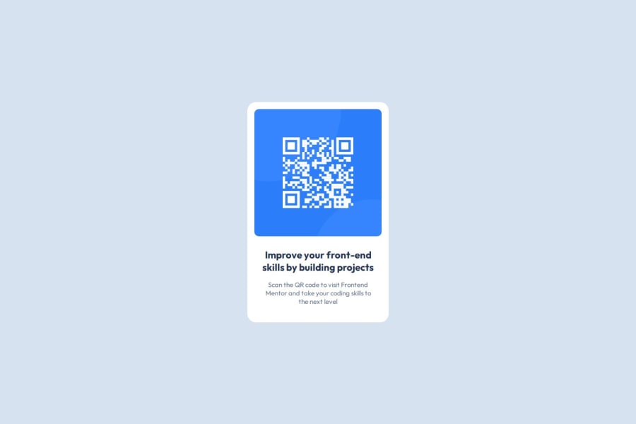
Design comparison
Solution retrospective
I developed the project using the Figma design file and utilized CSS flexbox. Next time, I would like to try using CSS Grid.
What challenges did you encounter, and how did you overcome them?Obtaining the correct card size and margins for the elements was somewhat challenging, but I used the Figma design to get them as close as possible.
Community feedback
- @Islandstone89Posted 7 days ago
Hello, good job!
Here are my suggestions - I hope you find them helpful :)
HTML:
-
Every webpage needs a
<main>that wraps all of the content, except for<header>andfooter>. This is vital for accessibility, as it helps screen readers identify a page's "main" content. Wrap the card in a<main>. -
The alt text should be written naturally, without using
-between the words. Write something short and descriptive, without including words like "image" or "photo". Screen readers start announcing images with "image", so an alt text of "image of qr code" would be read like this: "image, image of qr code". The alt text must also say where it leads(the frontendmentor website). A good alt text would be "QR code leading to the Frontend Mentor website." -
Headings should always be in order, so you never start with a
<h3>. I would change the heading to a<h2>- a page should only have one<h1>, reserved for the main heading. As this is a card heading, it would likely not be the main heading on a page with several components. -
You don't need to wrap the image or the text in a
<div>. -
It's recommended to add a class on elements.
-
Ideally, your HTML would look something like this:
<main>
  <div class="container">
    <img src="./images/image-qr-code.png" alt="QR code leading to the Frontend Mentor website." class="qr-image">
    <h2 class="heading">Improve your front-end skills by building projects</h2>
    <p class="text">Scan the QR code to visit Frontend Mentor and take your coding skills to the next level</p>
  </div>
</main>
CSS:
-
Including a CSS Reset at the top is good practice.
-
It's not common to set styles on the
html, so move those properties to thebody. Removefont-size: 16px, as that is the default value, meaning it doesn't need to be declared. Also, font size must always be inrem. -
I recommend adding a bit of
padding, for example16px, on thebody, to ensure the card doesn't touch the edges on small screens. -
On the
body, changeheighttomin-height: 100svh- this way, the content will not get cut off if it grows beneath the viewport. Remove thewidth, as block elements are 100% wide by default. -
Remove all widths and heights in
px. We rarely want to give a component a fixed size, as we need it to grow and shrink according to the screen size. -
We do want to limit the width of the card, so it doesn't get too wide on larger screens. To solve this issue, give the card a
max-widthof around20rem. -
Since all of the text should be centered, you only need to set
text-align: centeron the body, and remove it elsewhere. The children will inherit the value. -
On the image, add
display: block,height: autoandmax-width: 100%- the max-width prevents it from overflowing its container. Without this, an image would overflow if its intrinsic size is wider than the container.max-width: 100%makes the image shrink to fit inside its container.
Marked as helpful0@Anan-KaranjaPosted 7 days ago@Islandstone89 This is really helpful! I will definitely try these tricks moving forward. Thank you!
1@Islandstone89Posted 7 days ago@Anan-Karanja Glad to help! I would be happy if you marked my feedback as helpful :)
0 -
- @CodeByReloPosted 7 days ago
Your solution is overall well-structured and clean, The layout is responsive and The design stays true to the original concept, good job.
0
Please log in to post a comment
Log in with GitHubJoin our Discord community
Join thousands of Frontend Mentor community members taking the challenges, sharing resources, helping each other, and chatting about all things front-end!
Join our Discord
