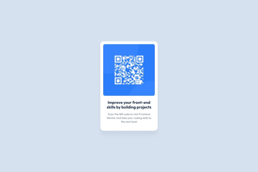
Design comparison
Solution retrospective
What am I proud of and what I would do differently next time:
- The code is easy to understand and follows a logical structure.
- Closely matching the design specifications.
- Ensuring the component looks good on different screen sizes.
Challenges encountered:
- Matching Design Precisely: Challenge: Ensuring the component matched the provided design down to the smallest detail. Solution: Used design tool Figma(since this is Free+) and browser inspection to measure elements and fine-tune CSS properties.
- Ensuring the component looks good on different screen sizes.
- How to use media query?
Community feedback
- @Liyyy9Posted 3 months ago
Great job completing this challenge! I have a few suggestions for improvement based on feedback I received for the same project. I think they could be useful for you as well.
HTML:
-
Add a
<main>element to wrap all of your content except the<header>and<footer>. This improves accessibility and acts as a landmark for your webpage. Make sure to include your card within the<main>element. -
Consider changing your
<p class="para1">tag to an<h2>tag. Typically, a page should only have one<h1>tag for the main heading. Since this challenge doesn’t include a main heading, it would be appropriate to use an<h2>tag instead.
CSS:
-
Don’t forget to include a fallback font in your
font-familyproperty. It should be specified like this:font-family: 'Outfit', sans-serif;. -
Avoid using
pxforfont-size. Instead, useremunits to ensure the font size scales with the user’s default browser settings, which enhances accessibility. -
Since you want all text to be centered, you only need to apply
text-align: centerto the<body>element. The child elements will inherit this property, so you can remove any redundanttext-align: centerdeclarations from elsewhere.
Hope this helps!
Marked as helpful0@aniketinTechPosted 3 months ago@Liyyy9 Thank you so much for your feedback. I'll consider your suggestions and that's helpful. Thank you so much for your time.
1 -
- @Patolin3084Posted 3 months ago
It has turned out almost perfect, it is a little too wide and that is why the distribution of the words in the text is not correct. It is likely that correcting the width and text justification value can be resolved.
0@aniketinTechPosted 3 months ago@Patolin3084 Thank you for your suggestion. I guess I messed up while taking the screenshot because when you open the website it looks perfect. Still, I'll look into it. Thanks!
0
Please log in to post a comment
Log in with GitHubJoin our Discord community
Join thousands of Frontend Mentor community members taking the challenges, sharing resources, helping each other, and chatting about all things front-end!
Join our Discord
