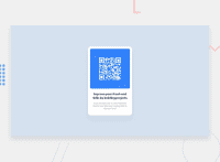
Design comparison
SolutionDesign
Community feedback
- @GregLyonsPosted over 2 years ago
Congrats on your first challenge! Your solution looks good. Here are some tips for future challenges:
- Consider using a CSS Reset. Many elements in HTML have some default styles applied to them, like some top/bottom margin on
<p>tags. In this case, those margins end up being in line with the design, but oftentimes you may find yourself struggling to remove a lot of default stylings to get your work to look more like the design. A CSS Reset like the one above should alleviate this, and give other more sensible defaults to start from. - Your card wrapper has a
width: 20%. This looks good on larger screens, but as you shrink the screen horizontally the card gets too narrow too quickly. Something like minmax or clamp are helpful to give a minimum and maximum width for your content, which will make your designs more responsive.
Good work again, and best of luck on future challenges!
Marked as helpful0 - Consider using a CSS Reset. Many elements in HTML have some default styles applied to them, like some top/bottom margin on
Please log in to post a comment
Log in with GitHubJoin our Discord community
Join thousands of Frontend Mentor community members taking the challenges, sharing resources, helping each other, and chatting about all things front-end!
Join our Discord

