QR Code Component - First Frontendmentor Project


Design comparison

Solution retrospective
I am proud of my attention towards accessibility. It's a topic that is dear to me, and I'd ideally like to make my websites as accessible as possible, while still being able to provide beautiful designs. As such, I try to learn and pay as much attention to this aspect as I can. This was a good way to put some of the things I'd learned into practice.
I'm proud of the fact that I could tell things were off, when I was using only the provided .jpg files in the beginning, and generally going entirely by eye. I couldn't tell exactly what or how to fix things to have them look identical, however. So that is something I'd like to get better at.
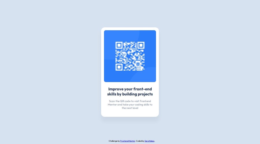
I was given a challenge by my brother (who's an experienced web developer) to use SVGs for the QR code and to have it be two images on top of each other. After a lot of trial and error, plus hours of troubleshooting, I was finally able to understand the possibilities, limitations and methods of positioning for a scenario like that. I'm proud that I stuck with it and kept refining, even after I'd already considered the project to be done.
What challenges did you encounter, and how did you overcome them?I really struggled to figure out if there was indeed a box-shadow or not. I thought there was, but I couldn't replicate the effect at first. Eventually I decided to play around with the figma files, and I found out that there actually was a box-shadow like I'd thought, but that it was also using the alpha value, to make it almost invisible. Once I applied this knowledge, I got the shadow effect spot-on.
I was also struggling greatly with the positioning of the QR code element itself, when trying to center it inside the blue background. After continuing my training on Codecademy, I learned more about positioning and was able to apply some of that knowledge to help fix the issues. I was still struggling with fully centering the QR element, until I thought to check the figma file, take the measurements from there and apply a "top" and "left" offset in the stylesheet, to center it within the container.
What specific areas of your project would you like help with?I would like to know if my code is generally structured well or not, and if I've made the page to a decent level of accessibility.
Also, while I used all the information I could glean from the figma files, I'm curious if that is how web developers generally use figma design files. Do you take as much information as you can from the design files and then translate that into your code, or how do you usually work with design files like that?
Is there anything in my code that I should have done differently, to either make it easier on myself or to make the code better/more easily readable?

Join our Discord community
Join thousands of Frontend Mentor community members taking the challenges, sharing resources, helping each other, and chatting about all things front-end!
Join our Discord