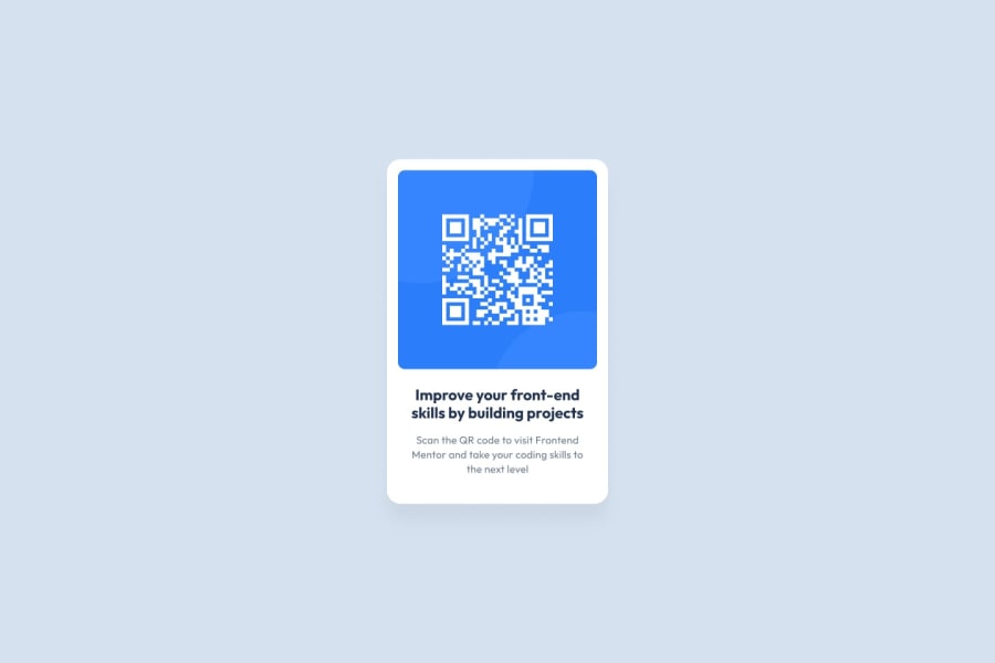
Design comparison
SolutionDesign
Community feedback
- @JohanPeraldiPosted over 1 year ago
That’s pretty close, well done! I can see three small things you can do to make your solution even closer to the design that was provided:
- Change the colour of the h2 title (which could/should? be an h1) to the dark-blue colour provided in the style-guide.md -> hsl(218, 44%, 22%);
- Add a box-shadow to your container;
- Decrease the spacing between the QR code image and the container, almost by half. Either remove the padding or give your imgBox a 100% width instead of 90%. Other than that it looks good!
Marked as helpful2@AsterodeiawdPosted over 1 year ago@JohanPeraldi Many thanks to your comments, I will have a try later!
0
Please log in to post a comment
Log in with GitHubJoin our Discord community
Join thousands of Frontend Mentor community members taking the challenges, sharing resources, helping each other, and chatting about all things front-end!
Join our Discord
