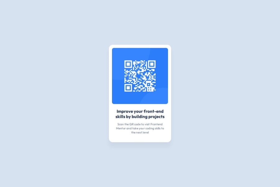
QR-Code component, fairly responsive and hosted on GitHub pages.
Design comparison
Solution retrospective
True vertical alignment is old as the web dev itself and yet something I have to keep in mind. With a flexbox model it is quite easy to make it happen, however I would need more time practicing it. to Be able not to forget. I am most proud of, that it was relative easy for me to understand the figma file and read all the parameters, including shadows. Was fun!
What challenges did you encounter, and how did you overcome them?- As mentioned earlier, vertical alignment is something I do forgot.
- Box model was also ignored, what brings of an Idea to make some kind of default css sheet to work on with each project.
- Researches on Github pages with its not recognizing the css and images help me to improve and solve few issue with hosting of my another website on github pages.
- Need to learn a bit more about GAP property
If anyone ever gets to that project, I would love to receive any feedback about how css could be made shorter and cleaner (neater) and have I used the correct elements to layout this component page. Thank you!
Community feedback
- @StroudyPosted about 2 months ago
Exceptional work! You’re showing great skill here. I’ve got a couple of minor suggestions that could make this stand out even more…
-
Using a
<main>
tag inside the<body>
of your HTML is a best practice because it clearly identifies the main content of your page. This helps with accessibility and improves how search engines understand your content. This should be amain
<section class="content">
-
For future project, You could download and host your own fonts using
@font-face
improves website performance by reducing external requests, provides more control over font usage, ensures consistency across browsers, enhances offline availability, and avoids potential issues if third-party font services become unavailable. Place to get .woff2 fonts -
Using a full modern CSS reset is beneficial because it removes default browser styling, creating a consistent starting point for your design across all browsers. It helps avoid unexpected layout issues and makes your styles more predictable, ensuring a uniform appearance on different devices and platforms, check out this site for a Full modern reset
I hope you’re finding this guidance useful! Keep refining your skills and tackling new challenges with confidence. You’re making great progress—stay motivated and keep coding with enthusiasm! 💻
Marked as helpful1@begli-amanovPosted about 2 months ago@Stroudy
Much appreciate your valueable feedback.
- I've added modern CSS reset
- Hosted the fonts with woff2 Format
- Changed section to Main.
- Refined a bit both template and css file.
Looking forward for the future project and challenges. Thank you!
0@StroudyPosted about 2 months agoHey @begli-amanov, I hope it was helpful, You got this bro! 💪
0 -
Please log in to post a comment
Log in with GitHubJoin our Discord community
Join thousands of Frontend Mentor community members taking the challenges, sharing resources, helping each other, and chatting about all things front-end!
Join our Discord