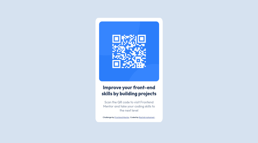
Design comparison
Community feedback
- @PhoenixDev22Posted almost 3 years ago
Greeting @RachidMoha2002 ,
I have few suggestions regarding your solution:
-
There should be two landmark components as children of the body element - a
main(which will be the card ) and afooter(which will be the attribution).<Footer>should not be in the<main >. HTML5 landmark elements are used to improve navigation . -
Alt text is needed on that image for assistive tech and SEO search engines .So it needs to contain a description likeQr code not empty .
-
To center the card on the middle of the page , you can use the flexbox properties and
min-height: 100vhfor the<body>like this :
body{
display:flex;
align-items: center;
justify-content: center;
width: 100%;
min-height: 100vh;
And remove the margins from the .container
- Never use
pxfor font size . Usingpxwon't allow the user to control the font size based on their needs.
Overall , your solution is good.Hopefully this feedback helps.
Marked as helpful0 -
Please log in to post a comment
Log in with GitHubJoin our Discord community
Join thousands of Frontend Mentor community members taking the challenges, sharing resources, helping each other, and chatting about all things front-end!
Join our Discord
