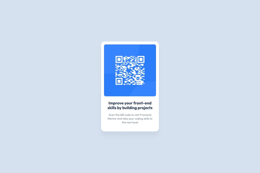
Design comparison
SolutionDesign
Community feedback
- @eboguckaPosted 9 months ago
Hi there 👋🏼
Good job with this challenge! It looks very close to the design, the only differences I can see are that the QR code image's corners aren't rounded and the text is black instead of using the colours from the style guide. But I'm just nitpicking here!
Happy coding!
0
Please log in to post a comment
Log in with GitHubJoin our Discord community
Join thousands of Frontend Mentor community members taking the challenges, sharing resources, helping each other, and chatting about all things front-end!
Join our Discord
