Not Found
Not Found
Not Found
Not Found
Not Found
Not Found
Not Found
Not Found
Not Found
Not Found
Not Found
Not Found
Not Found
Not Found
Not Found
Not Found
Not Found
Not Found
Not Found
Not Found

Submitted

QR Code Component

Bambijow 10

@Bambijow

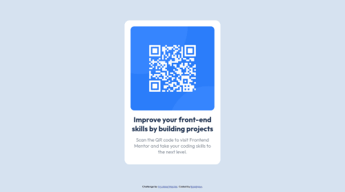
Desktop design screenshot for the QR code component coding challenge

This is a solution for...

  • HTML
  • CSS
1newbie
View challenge

Design comparison


SolutionDesign

Solution retrospective


Hello,

I'm pretty new to frontend development since I'm initially a backend developer, so if you have any advice about my code, feel free to send constructive feedback. Here a question I ask myself :

  • Is there any easiest way to build this component ? Because I feel like I've wrote a lot of unnecessary code.

Community feedback

@VCarames

Posted

Hey @Bambijow, some suggestions to improve you code:

  • To give you HTML code structure, you want to set up your code in the following manner (only did parent containers):
  <body>
    <main>
      <article class="card-container”>
      </article>
    </main>
  </body>

The Main Element identifies the main content of the document.

While the Article Element will serve as the card’s container, because the card represents a complete, or self-contained, section of content that is, in principle, independently reusable.

More info:

https://web.dev/learn/html/headings-and-sections/

  • The Alt Tag description for the QR image needs to be improved upon. Its needs to tell screen reader users what it is and where it will take them to when they scan it.

  • The following will reduce the amount of code needed and make your content responsive:

body {
    background-color: hsl(212, 45%, 89%);
    font-family: 'Outfit', sans-serif;
    min-height: 100vh;
    display: flex;
    flex-direction: column;
}

.container {
    max-width: 320px;
 
    margin: auto;
    padding: 16px;
    border-radius: 20px;
    background-color: hsl(0, 0%, 100%);
    text-align: center;
}


.card--image {
    width: 100%;

    margin-bottom: 15px;
    border-radius: 15px;
}

.card--title {
    color: hsl(218, 44%, 22%);
    font-weight: 700;
    font-size: 22px;
    margin-bottom: 15px;
}

.card--paragraph {
    font-weight: 400;
    font-size: 16px;
    color: hsl(214, 3%, 55%);
}

Happy Coding! 👻🎃

Marked as helpful

0

@MaxiTRR

Posted

Hi! Very good! I can suggest you, if you want to center the components for this types of challenges, to use

body {
  display:flex;
  justify-content:center;
  align-items:center;
}

This will center your whole component without using margins of any kind, making more easy the responsiveness. (it is not a good practice doing this in a more complex project from waht i have understand, but it works fine whith this cahllenges)

Marked as helpful

0
Lucas 👾 104,420

@correlucas

Posted

👾Hello @Bambijow, Congratulations on completing this challenge!

Great code and great solution! I’ve few suggestions for you that you can consider adding to your code:

Reduce your code by removing unnecessary elements. The HTML structure is working but you can reduce at least 20% of your code by cleaning the unnecessary elements, you start cleaning it by removing some unnecessary <div>. For this solution you wrap everything inside a single block of content using <div> or <main> (better option for accessibility) and put inside the whole content <img> / <h1> and <p>.

<body>
<main>
<img src="./images/image-qr-code.png" alt="QR Code Frontend Mentor" >
 <h1>Improve your front-end skills by building projects</h1>
<p>Scan the QR code to visit Frontend Mentor and take your coding skills to the next level</p>
</main>
</body>

✌️ I hope this helps you and happy coding!

Marked as helpful

0

Please log in to post a comment

Log in with GitHub
Discord logo

Join our Discord community

Join thousands of Frontend Mentor community members taking the challenges, sharing resources, helping each other, and chatting about all things front-end!

Join our Discord