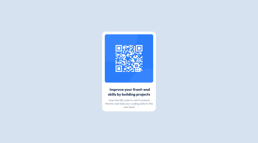
Design comparison
Solution retrospective
If you have any advice to improve my solution, don't hesitate to send feedback.
Community feedback
- @sandro21-glitchPosted almost 2 years ago
Hi Othman
Here are some suggestions to improve the code
Use CSS reset to standardize the default styles across different browsers.
Use CSS variables for color values, so that it's easier to change the color palette in the future.
Consider using CSS Flexbox or CSS Grid for layout, especially if you plan to have more elements in the future.
Using absolute positioning to center an element has some limitations, such as not being flexible with the size of the parent container. An alternative solution is to use Flexbox or Grid layout for centering elements.
With Flexbox, you can center an element both vertically and horizontally using the following CSS:
.container { display: flex; align-items: center; justify-content: center; height: 100vh; /* or any desired height */ }.centered-element { /* styles for the centered element */ }With Grid, you can center an element in a similar way:
.container { display: grid; place-items: center; height: 100vh; /* or any desired height */ }.centered-element { /* styles for the centered element */ }Happy Coding
Marked as helpful0@Francisco-M-MirandaPosted almost 2 years ago@sandro21-glitch
It's better if you use
min-height: 100vh;insteadheight: 100vh;within.containerMarked as helpful0@sandro21-glitchPosted almost 2 years ago@Francisco-M-Miranda
Yes, that's correct.
If you have only one container in the center of the page and are using height to set its height to 100vh, then you might encounter issues with content overflow or content being hidden if the content is taller than the viewport. In such cases, using min-height: 100vh; would be a better option, as it will ensure that the container takes up at least 100vh of the viewport, but can expand to accommodate its contents if they are taller than 100vh.
1@OzmanGhPosted almost 2 years ago@sandro21-glitch First of all, thank you so much for your feedback, this really helpful. Most of the time for more complex designs, I've used CSS grid for multi-dimensional layout and Flex-box for normal layout since this was simple I didn't consider using them but I'm aware know about flexibility issues. I didn't get what did you mean by saying CSS reset? On the other hand, I have no idea how to use CSS variables yet 😅. since it's my first time here may I ask how can I fix or change my code is it from the GitHub repositories
0@OzmanGhPosted almost 2 years ago@Francisco-M-Miranda Thanks for your feedback this was really helpful😊.
1
Please log in to post a comment
Log in with GitHubJoin our Discord community
Join thousands of Frontend Mentor community members taking the challenges, sharing resources, helping each other, and chatting about all things front-end!
Join our Discord
