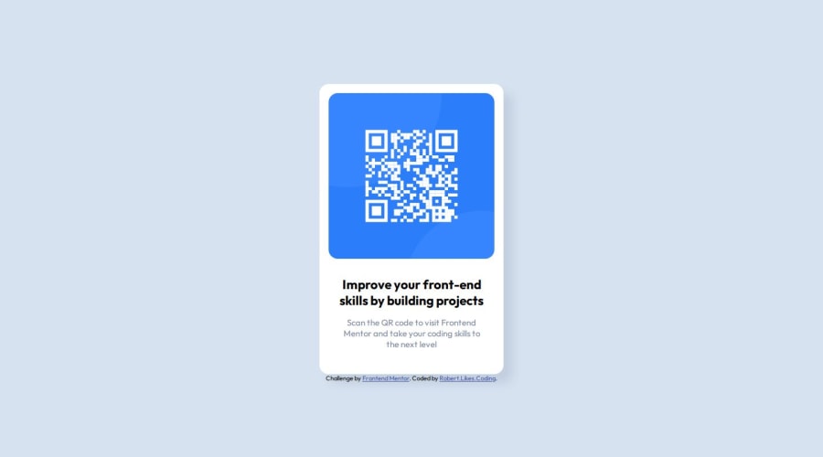
Design comparison
Solution retrospective
I'm proud of having been able to create this without needing to look for help. I wish though I would have known a way for how to center the card without using Flexbox.
What challenges did you encounter, and how did you overcome them?I got stuck when I was trying to put the QR image into a div. The image kept being bigger than the div. I couldn't make it work so I removed the div and got it working without it.
What specific areas of your project would you like help with?Making Images fit divs. Positioning them too.
Community feedback
- @danielmrz-devPosted 8 months ago
Hello @RobertLikesCoding!
Your solution looks excellent!
I have a suggestion that might interest you:
📌 If you don't have the Figma design files, I recommend using a browser extension called Perfect Pixel.
It allows you to compare your finished project with the design images that come along when you download the project and check the (almost exact) dimensions. It's very useful!
I hope it helps you in future projects! 😊
Other than that, great job!
Marked as helpful0@RobertLikesCodingPosted 8 months ago@danielmrz-dev Thanks Daniel, that's a great recommendation! Sounds like a good tool to have so I'll give it a go :)
1 - @SergiolunabellidoPosted 8 months ago
Esta solución es accesible en mi cuenta de GitHub, las mejoras que yo veo que se podrían hacer seria una mejor sintaxis para renderizarlo, es verdad que el código esta bien estructurado en orden a la edición y objetos colocados . Este es una pagina responsive lo que hace que se vea bien en todo tipo de pantallas adaptándose a estas.
0
Please log in to post a comment
Log in with GitHubJoin our Discord community
Join thousands of Frontend Mentor community members taking the challenges, sharing resources, helping each other, and chatting about all things front-end!
Join our Discord