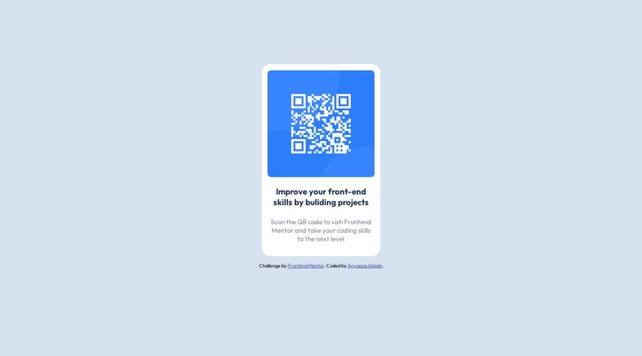
Design comparison
Solution retrospective
All Feedbacks are welcome!! While building the project, I'm facing issues with media queries because I am a beginner. Could you please provide some suggestions that will help me to do future challenges
Community feedback
- @funficientPosted about 1 year ago
Hey, congratulations on submitting your first challenge! Well done!
Media queries are used to specify any changes in the layout between different media sizes to make it more responsive. For this challenge there is no difference between a mobile and desktop layout (looking at the design files), thus you don't need any media queries (even though they specify mobile and desktop sizes in the style guide).
If, however, the layout changed, you would want to use the media query to specify what is different between one layout and another. For example, let's say the font size changes to fit better on a mobile screen, then you might have main css like:
h1 { font-size: 3em; }
And when the same code is displayed on a mobile device (size obtained from the stylesheet) it will look like this:
@media (max-width: 375px) { h1 { font-size: 2em; } }
So, for a device with a screen size between 0 and 375px the header 1 text will be 2em in size, and as soon as it gets bigger than that, the code above it will be used, in this case 3em for header 1 text.
Here is a better explanation with more examples: https://developer.mozilla.org/en-US/docs/Learn/CSS/CSS_layout/Media_queries
Hope that helps! Good luck with your next challenge! Kate
Marked as helpful1
Please log in to post a comment
Log in with GitHubJoin our Discord community
Join thousands of Frontend Mentor community members taking the challenges, sharing resources, helping each other, and chatting about all things front-end!
Join our Discord