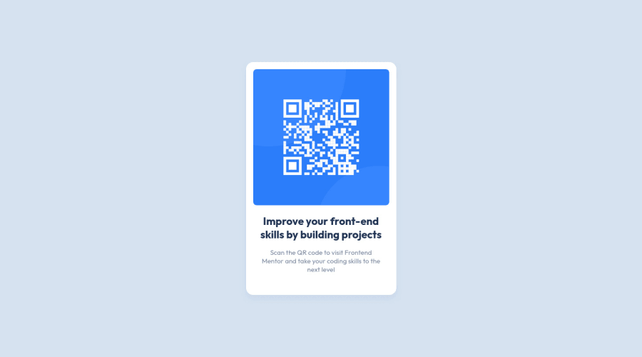
Design comparison
Solution retrospective
Hello Everybody! 👋
This is my first solution for Frontend Mentor, so any feedback or suggestions on how I can improve my HTML and CSS are much appreciated!
Specific feedback I would love to hear:
- Best practices I can apply to my semantic HTML and CSS
- Alternate methods for styling
Community feedback
- @gtalnzPosted almost 2 years ago
Hi Kegan,
Fantastic first solution!
Your HTML is just about perfect I would say. The only thing I would recommend is to include height and width attributes on the img element. This tells the browser how much space to give the image even before it loads, which helps to prevent layout shift. You can see this in action if you throttle your network speed in dev tools and reload the page.
If you wanted to include the attribution section you have commented out, I'd also put that into a footer element for semantic purposes.
In your CSS I like that you've included comments to explain your decision-making. For your body tag you've used the place-content shorthand. This saves one line of space but, unlike justify-content and align-items, it is not supported in pre-chromium versions of Edge and not at all in IE, so you may want to avoid using it if those old browsers are still prevalent among your users.
You probably didn't need the grid on your qr-card__content. All you're gaining from it is the gap property, which in this case could be a single margin on either the h1 or p tag instead. I can understand why you'd use grid here though, as if you add more content to the card it would keep things simple.
Your page overflows on widths lower than 337px (with default font sizes) because you haven't set a max-width for the image. You can calculate what that needs to be using the viewport width and your --card-padding variable.
My only other comment would be that rather than base your card size off the image width, could you base the image width off the desired card size instead? Either way works fine, it just feels like the image width variable is a bit arbitrary, while a targeted total size for the card seems more logical to me.
All in all, a very professional job and much better than mine :P
Keep it up!
Marked as helpful1@KeganFPosted almost 2 years ago@gtalnz Thanks for your feedback!
- Good catch on the overflow problem. I'm still getting familiar with responsive design, so I'll have to keep that in mind for next time. I fixed the problem by doing this:
.qr-card__img {
  width: 100%;
  max-width: var(--image-width);
}
The contents of the card will start to look a little bit strange when scaled below ~250px, but at least it fixes the issue with the card overflowing! (until ~150px)
-
On my next challenge I'll probably leave the attribution in, and I'll make sure to wrap it in a footer.
-
You're right that I could've based the image size on the card and not the other way around! That's actually what I would've done normally, but I wanted to try switching things up for this project and let the content of the card define its dimensions rather than specifying it and fitting the content to the card. I'm not sure if one method is considered better practice than the other, but it's definitely something I'll look more into 😀
Cheers!
0 - @MelvinAguilarPosted almost 2 years ago
Hello there 👋. Good job on completing the challenge !
I have one suggestions about your code that might interest you.
CSS 🎨:
-
Using
height: 100%for the body element can cause problems with the layout of the page on smaller screens, such as in landscape view on a mobile device.On smaller screens, such as in landscape view on a mobile device, the height of the viewport may be less than the height of the content of the page. In this case, using height for the body element will cause the content of the page to be hidden behind the body element.
Here is an image of how it would look on a mobile device (taking into account the scroll): FireShot Capture - Frontend Mentor - QR code component - keganf github io
To avoid this problem, it is generally recommended to use
min-height: 100vhinstead ofheightfor the body element. This will ensure that the content of the page is always visible.
I hope you find it useful! 😄
Happy coding!
Marked as helpful1@KeganFPosted almost 2 years ago@MelvinAguilar Thank you for your feedback! After making the change to
min-width: 100vhthe clipping issue has been fixed, and I'll be sure to keep an eye out for this type of problem in the future! 😀1 -
- Account deleted
Hello!... Congratulations on completing this challenge. 🎉🎉🎊
Here some solutions to improve your code.
CSS:
I recommend you use CSS reset, because your css reset is not used. Normalize CSS
Your solution is very good, good job!!
Happy coding🎉🙃
Marked as helpful1@KeganFPosted almost 2 years ago@Khris26 Thank you for your feedback! I'm fairly new to relative sizing, so I'll keep in mind your suggestion for proper use of
remandemas I work on more projects!I have seen people using Josh Comeau's CSS Reset, and his website does a great job of breaking down what each section of code does. I'll definitely start using it for future builds!
0
Please log in to post a comment
Log in with GitHubJoin our Discord community
Join thousands of Frontend Mentor community members taking the challenges, sharing resources, helping each other, and chatting about all things front-end!
Join our Discord
