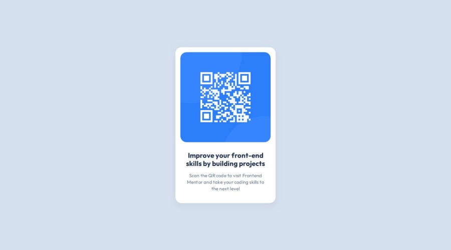
Design comparison
Solution retrospective
Proud of submitting my first solution
What challenges did you encounter, and how did you overcome them?- identifying the correct padding and margin from the Figma file. I was able to try out the dev mode version on Figma which was very helpful.
- setting up correctly the padding and margin via CSS, trial and error eventually paid off
is there a better way to have consistent margin and padding that are reflecting the design?
Community feedback
- @danielmrz-devPosted 4 months ago
Hello there!
Congrats on completing the challenge! ā
Your solution is really impressive!
I've got a couple of ideas (about how to use HTML better) that could make it even stronger:
š First: Think about using
<main>
to wrap your main content instead of<div>
.Imagine
<div>
and<span>
in HTML as basic containers. They're good for holding stuff, but they don't tell us much about what's inside or its purpose on the webpage.š Second: Consider using
<h1>
for your main title instead of<h2>
.It's more than just text size ā it's about structuring your content effectively:
- The
<h1>
to<h6>
tags are used to define HTML headings. <h1>
is for the most important heading.<h6>
is for the least important heading.- Stick to just one
<h1>
per page ā it should be the main title for the whole page. - And don't skip heading levels ā start with
<h1>
, then use<h2>
, and so on.
These tweaks might not change how your page looks, but they'll make your HTML code clearer and help with SEO and accessibility.
Hope that's helpful!
Keep up the great work!
Marked as helpful0 - The
Please log in to post a comment
Log in with GitHubJoin our Discord community
Join thousands of Frontend Mentor community members taking the challenges, sharing resources, helping each other, and chatting about all things front-end!
Join our Discord