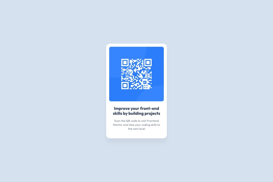
Design comparison
Community feedback
- @grace-snowPosted 7 months ago
There are some important issues in this that need refactoring.
- It's great you've included a main landmark. But the attribution belongs in a
footernot main. Make sure you update your link in the footer too, so it goes to your github or frontend mentor profile. - The image is the most important content on this whole challenge. It's definitely not a decorative image so must have alt text that says what it is (QR code) and where it goes (to FrontendMentor.io).
- This is a card component being built in isolation. But when we build components we have to think about how they will be used on the end website. This kind of card would never act as the title for a whole page, so it should not have a h1. Use a h2 instead. 4.Get into the habit of including a full modern css reset at the start of the styles in every project. Andy Bell or Josh Comeau both have good ones you can look up and use. That will set sensible defaults for cross browser styling.
- Your solution is broken when viewed on my phone, especially in landscape orientation because you have set the html, body and main height all to 100%. Remove this. To center the component on the screen all this needs is a min-height 100svh on the way, and flex column properties for the centering.
- Font size must be in rem not px.
- The card should not have an explicit width, especially not in px. This is an important principle to understand. When you set width it is fixed and removes all options for the browser to be able to make adjustments when it needs to. Instead, set a max-width in rem. This allows the card to shrink narrower if it needs to, like when viewed on a smaller screen. And using rem means the layout will scale correctly for all users including those who have a different text size.
- To ensure the component can't hit screen edges you can give a wrapping element padding (like the body).
- It looks like you have double padding at the end of the card. I recommend you onle set padding-inline on the content or use an alternative method if you want to limit its width within the card (eg margin-inline auto and a max width in rem or ch units).
There may be a couple of other things I'm not sure when the css is so hard to read minified.
Marked as helpful0@emzzz56Posted 7 months ago@grace-snow Thanks, for your review. I've refactored the code to meet your suggestions. Only one thing I didn't refactor which is the h1 tag; if I make it h2 or remove it, it won't pass the accessibility test on frontendmentor.io But for sure I agree with you in a real project scenario it shouldn't be h1. Thank you
0@grace-snowPosted 7 months ago@emzzz56 I'm a senior accessibility consultant so an confidently tell you it will pass but there will be a warning about the missing h1. But it is absolutely fine.
If you really want no warnings you can add a visually-hidden (otherwise known as "sr-only") h1 above the component saying something like "QR component demo" or similar.
Marked as helpful0 - It's great you've included a main landmark. But the attribution belongs in a
- @stewil87Posted 7 months ago
Hey Eman Salama! Good to see your solution.
I would recommend to put anything around an image, like a
div, if it is on the same node level like anotherdiv. It might help prevent other issues. This was also the base for my real tip :D => also without adivaround the image, if you put aline-height: 0on.boxyou remove the (not wanted) space betweenimgand.contentMarked as helpful0@grace-snowPosted 7 months ago@stewil87 this would be solved by having a css reset which should be included at the start of the styles in every project anyway. Theres no need to change line height on an image when they're set to display block already.
1@emzzz56Posted 7 months ago@stewil87 Thanks, Stefan for your review The issue was solved when I added reset CSS as the reset CSS has an image display block. Your solution is an excellent alternative if I don't use reset CSS
1 - P@bluethreadmadePosted 7 months ago
Your solution looks very close to the design. You have too much space between the end of the text and the end of the card. Your name at the bottom is rendering as a link because you have it in an a tag but it doesn't go anywhere when interacted with. The CSS is hard to read, it looks like it is all in one line but I don't know if that meets another standard that I am not aware of.
Marked as helpful0@grace-snowPosted 7 months ago@bluethreadmade the css has been minified. That's a good thing and should be done on all real production sites.
BUT, you're right CSS should not be minified on practice projects when someone wants feedback because it's no longer readable. @emzzz56 please expand the css so we can read it and give you feedback! Thanks
0@emzzz56Posted 7 months ago@bluethreadmade Thank you Megan for your review. Minified CSS is better for production as it boosts performance, but I agree that I shouldn't minify CSS for practice projects. I've expanded the CSS for better readability. I've refactored my code to meet your suggestions. Thank you
0
Please log in to post a comment
Log in with GitHubJoin our Discord community
Join thousands of Frontend Mentor community members taking the challenges, sharing resources, helping each other, and chatting about all things front-end!
Join our Discord
