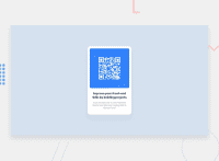
Design comparison
Solution retrospective
Any feedback and best practices advice would be appreciated!
Community feedback
- @shashreesamuelPosted over 2 years ago
Hey good job completing this challenge.
Keep up the good work
Your solution looks great however I think that your solution needs to have a subtle box-shadow using
box-shadow. Secondly I think that the border-radius on your card needs to be increased a little.I hope this helps
Cheers Happy coding 👍
Marked as helpful1@kkrataPosted over 2 years ago@TheCoderGuru Thank you! I actually added the box-shadow, maybe it's too subtle :)
0 - @PhoenixDev22Posted over 2 years ago
Greeting kkrata,
Great work on completing your Frontend mentor challenge,
I have few suggestions regarding your solution:
- There should be two landmark components as children of the body element - a
main(which will be the component ) and afooter(which will be the attribution).<Footer>should not be in the<main >. HTML5 landmark elements are used to improve navigation .
CSS
- Consider using
min-height: 100vh;to the body, this allows the body to set a minimum height value based upon the full height of the viewport also allows the body to to grow taller if the content outgrows the visible page.
General points :
- Remember a css reset on every project. That will do things like set the images to display block and make all browsers display elements the same.
Overall , your solution is good. Hopefully this feedback helps.
Marked as helpful1@kkrataPosted over 2 years ago@PhoenixDev22 Thank you, it's very helpful!
Could you please elaborate your comment about the CSS reset? Do you mean setting the below on every project or should I do more?
'* { box-sizing: border-box; padding: 0; margin: 0; }'
1@PhoenixDev22Posted over 2 years ago@kkrata You are welcome, I’m glad it was helpful .
About your question likeNormalize.css makes browsers render all elements more consistently and in line with modern standards. It precisely targets only the styles that need normalizing.
0 - There should be two landmark components as children of the body element - a
- Account deleted
just wrap the content inside section container instead of a div and good job
Marked as helpful1 - @Alvin-KaranjaPosted over 2 years ago
Congratulations Kkrata, your work is perfect. Keep the momentum going.
1
Please log in to post a comment
Log in with GitHubJoin our Discord community
Join thousands of Frontend Mentor community members taking the challenges, sharing resources, helping each other, and chatting about all things front-end!
Join our Discord

