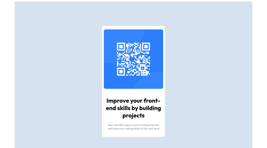
Design comparison
Solution retrospective
Hi!
I liked the challenge, so I'd like to ask:
-Is it a good idea to use the CSS grid for this case? Or maybe it's better to use it for something more complex?
-Is it better to use rem or px or '%' for Responsive?
Thanks
Community feedback
- @soyedPosted over 2 years ago
Hi @Naiforsyth Good job! completing this challenge
Great Questions by the way
some feedback:
- Yes, CSS Grid can be used to create this component.
- CSS Grid is used to setup layout for your page or for larger components of your website
- Flexbox can be used to style the content of your grid items or smaller components
- An example, The QR Code and the content of the card can be styled using Flexbox
- I would recommend reading this article
- For responsive using rem and % works fine. This is definitely a tricky one because these units have different use cases depending on what you are trying to accomplish.
- I would recommend reading this article
I hope that helps! 😊
Cheers, Sammy
Marked as helpful1 - Yes, CSS Grid can be used to create this component.
- @felontaPosted over 2 years ago
Hello @Naiforsyth 👋👋👋,
I will try to help with your questions hope I can,
-
1 - In question which way you will use to style your project, always choose the one you know the most and are comfortable with, never try to do something complex simply because it is complex, many developers (including me) at first think that doing something complex is better than doing the simple but it's totally the opposite, think that the simpler and more functional the code the faster it will run and have a better performance, always do what makes you more relaxed when coding, doing it that way you will have more confidence when coding and consequently learning more and more.
-
2 - About px, rem or % specifically about responsiveness it's better rem and % but that doesn't rule out the use of PX, for example when you want an image to always occupy half of your page regardless of the screen it is being displayed use % , but in others cases you will want, for example, that your logo always has the same size regardless of the screen that is being displayed in this case use PX, in the case of REM for fonts I always use it and I have already discarded the use of PX when it comes to fonts, because REM becomes much easier and more responsive in the overall design.
I hope I was able to help you in some way, I apologize for the explanation I'm not very good with it, if you have any doubts ask me and I'll try to help you :)
Congratulations on completing the challenge, Good Coding 🚀🚀🚀
Marked as helpful0 -
- @kelvinhe04Posted over 2 years ago
Hi, in this case is not necessary to use grid since the layout remains vertical.
Marked as helpful0 - @liamchivers23Posted over 2 years ago
Either 'rem' or percentage is fine for responsive design.
Good job on the challenge :)
Marked as helpful0
Please log in to post a comment
Log in with GitHubJoin our Discord community
Join thousands of Frontend Mentor community members taking the challenges, sharing resources, helping each other, and chatting about all things front-end!
Join our Discord
