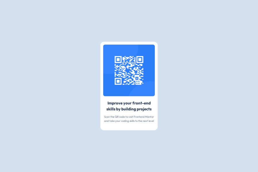
Design comparison
Solution retrospective
- Proud of Learning about frontend mentor rules for creating a project.
- Encountered challenge with Readme file, it's a very good learning for me to create proper documentation
- Please go through my project and let me know on the areas that I can improve.
Community feedback
- @grace-snowPosted 3 days ago
Great feedback above and we'll done for applying changes so quickly.
I've got a few more recommendations:
- get into the habit of including a full modern css reset at the start of the styles in every project. Andy Bell or Josh Comeau both have good ones you can look up and use.
- Look up how and when to write alt text on images. There are some great posts about this in the resources channel on discord. Remember, alt is human-readable content not code. This image is really important, so needs a proper description. It needs to say what the image is (QR code) and where it goes to in this case (to FrontendMentor.io).
- when building single components like this you still need to consider the context of where that component would be used in a real site. This card would never be used to serve the main heading on a page, so you know it shouldn't have a h1. Use a lower importance heading level like h2 instead.
- it's better for performance to link fonts in the html head instead of css imports.
- make sure the component can't hit screen edges by giving a wrapping element a little padding on all sides (eg body or main in this)
Note the deployed link seems to be broken above so I can't preview the finished version at all.
Marked as helpful0@Lokesh8055Posted 3 days ago@grace-snow ,
Thanks for all these suggestions. will make sure I will resolve all these issues in this project. also I have updated the deployment link you can check now
0@grace-snowPosted 2 days ago@Lokesh8055 This is looking much better, but the image alt isn't fixed. (And that would be a failure against accessibility requirements, it's essential to learn about this and understand how to write good alt text on images).
0@grace-snowPosted about 20 hours ago@Lokesh8055 I'm afraid you haven't done this alt correctly. This is not what this image description should be. The value in the description literally needs to be (1) what this image is ("QR code") and where it goes ("to FrontendMentor.io").
Don't overcomplicate it or write descriptions that miss the purpose/point of the image.
0 - @huyphan2210Posted 17 days ago
Hi, @Lokesh8055
I checked out your solution and I have some thoughts:
- Using
height: 100vh
on thebody
is okay for this challenge, but I'd recommend usingmin-height: 100vh
instead. This approach ensures that the body will expand if the content overflows, which is helpful in most cases (though there are some exceptions). Try applying this in future challenges as well. - Consider making your class names more descriptive. For instance, class names like
.improve
and.skills
don’t clearly convey what they’re styling, which can make your code harder to understand and maintain, especially if the text content changes. It might help to research CSS naming conventions (like BEM or utility classes) for more inspiration. - The combination:
section { max-width: 100%; width: 320px; }
may not work as intended. Instead, try:
section { max-width: 320px; /* Using rem units here can improve scalability */ // You don't need max-width: 100% since section is a block-level element }
This will allow the
section
to adapt better to different screen sizes. Usingrem
instead ofpx
for themax-width
also improves scalability, making it easier to adjust based on the user's font size settings. For this challenge, I think it's fine, though.Hope this helps!
Marked as helpful0@Lokesh8055Posted 4 days ago@huyphan2210 , Thanks for your suggestion I have added all changes in the project
1 - Using
Please log in to post a comment
Log in with GitHubJoin our Discord community
Join thousands of Frontend Mentor community members taking the challenges, sharing resources, helping each other, and chatting about all things front-end!
Join our Discord