


@PhoenixDev22
Posted
hello @LucLhote ,
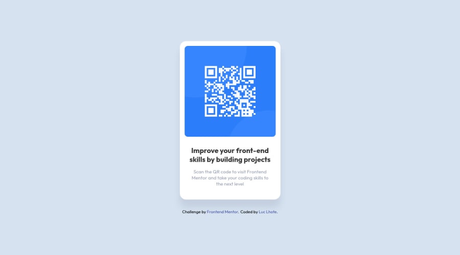
1 - In <img src="./images/image-qr-code.png" alt="">, there is alt attribute but the alternative text is missing . As this image is not decorative and it's an informative image. the alternative text shouldn't be blank .
2 - I don't fully understand what you mean in the second point could you explain it from a different angle?. I did analyse the mobile version and desktop version , the card surely has the same width in desktop and mobile layout . In this challenge, there is no need for any media query and setting an explicit width is not what is expected here the fixed width makes it difficult to have a responsive site. Also , I don’t restrict the width of the body element . If I need to restrict the width I would use a container div with a max-width on it.
3 - Using Height 100vh on body is causing content to be cut off on some mobiles . Avoiding this , I would use min-height: 100vh to allow the body to to grow taller if the content outgrows the visible page.
4- In the file style.guide.md doesn't necessitate to use px, you can use what it equates it in rem 18px = 1.125rem. It's better to use relative sizes.
hopefully the four points are clear now.
@PhoenixDev22
They are some points I am not agree with.
1- I had doubt about it. In my way to approach it I decided to not put a text. A person with vision issues, for example, may never seen how looks a QR code and, even, if the image/QR generator doesn't load, the alternative text brings no useful information, for a QR code at least. It will precise that it is a QR code and then what do the user? He quits the page because it doesn't content the main information of it (I'm talking about the case of that challenge). In fact my deep reflection is that this image (the QR) should be transform into a link. This would be more useful than an alternative text. Because yes the image contains an information but it is a link at the end. And maybe a QR will never be scan by some people with visual issues, it would be faster for them to click the link. I guess that, I don't have visual issues and I don't talk for them but I imagine the complexity of these things for them. By the way, I didn't do the link in my code because I forgot to apply it, I will fix that.
2- About the second point, I decided to follow the size the author(s) used. I am used to produce with relative sizes for the pages, but here, the real challenge for me was to see how to counter troubles with a fixed body width and make it responsive and the experience was interesting. It helps to face cases we could meet with design teams into a company and how make everyone happy to produce a solution quick and efficient.
3- Still about the second point, you say: "In this challenge, there is no need for any media query". Where is it wrote that this challenge doesn't or does need media queries? You can use whatever you want to arrive the final result. I wanted to use the principe of media queries as they answer the need for responsive websites. You coded it your way, and my way needed a media query, to work on the fixed size issue. Plus, a responsive website has to be responsive everywhere. It is exactly why media queries exist if you want to modify a page according to the device type and screen dimension for example. Maybe I could do easier, it is true, but I want to practice them.
4- About your third point, I didn't notice that before. I did some tests and actually it is the browser who brings this bug. Before I start to work with GitHub I was all the time testing with resizing the window on computer. It is a bad habit I have. I also saw a way to counter this with the property/value height: webkit-fill-available;. I will test your counter and the one I found thanks for the tip!
5- About your last point, as said already, I understand about the relative size for the font. I never use fixe values usually. I just used the values provided by the file and it allowed me to reproduce something similar to the design. With this I arrive to imagine approximatively the card size. And as already said, soon as the size wasn't precise I used the rem unit. I could convert but I am not gonna lie I chose the easy way here.
@PhoenixDev22
Posted
@LucLhote
Apologies for the delayed reply.
I value the time you have taken to explain your opinion. You have shared many ideas and insights that are helpful.
I'm not trying to say that you my vision is correct and has to be followed by everyone. I'm still a learner too. I agree with with that everyone has his approach for the challenges and I'm only suggesting , it's up to you, you want take those suggestions on board or not.
Thanks a lot for the valuable advice put yourself more in the skin of the dev in front of you., I'll remember whenever have a look on any dev's codes.
Sorry for any misunderstanding.
Hi @PhoenixDev22,
No problem at all, you pushed me to analyze my work deeper and allowed us to have an interesting exchange on our ways to approach the project. I even mentioned you in my README! 😁
I may have misunderstood the tone of your posts which made me respond the way I did so I also apologize too. Really thank you for taking the time to see the work I have done.🙂
