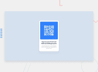
Design comparison
SolutionDesign
Solution retrospective
This is my first challenge on Frontend Mentor and any feedback is welcome. Thank you.
Community feedback
- @danielmrz-devPosted 10 months ago
Hello @rokandic!
Your solution looks great!
I have a suggestion for improvement:
- For semantic reasons, use
<main>to wrap the whole content instead of just the text. The whole card is the main content on the page.
📌 This tag change does not impact your project visually and makes your HTML code more semantic, improving SEO optimization as well as the accessibility of your project.
I hope it helps!
Other than that, great job!
Marked as helpful0 - For semantic reasons, use
Please log in to post a comment
Log in with GitHubJoin our Discord community
Join thousands of Frontend Mentor community members taking the challenges, sharing resources, helping each other, and chatting about all things front-end!
Join our Discord

