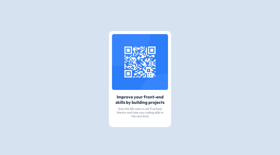
QR code component challenge using flexbox
Design comparison
Solution retrospective
I was proud of figuring out height: 100vh to center things vertically even though I know I was reinventing the wheel and I'm sure I saw it before in my introductory coursework. It was a solution that I worked out without a web search, which is kind of rare.
Next time I will think through and organize my approach in more detail before beginning any coding. I have subsequently done this with a different project and it made a huge difference in efficiency and keeping organized.
What challenges did you encounter, and how did you overcome them?I wanted to use flexbox as a layout tool even though it wasn't necessary. I struggled with understanding how to align elements after I had changed to a column layout. Understanding how the axis for alignment changes based on flex-direction made a big difference.
What specific areas of your project would you like help with?- How can I use comments effectively to organize my code as my projects get bigger?
- What are strategies to organize my CSS for easier navigation (group by element or by layout/color/font)?
Appreciate any tips!
Community feedback
Please log in to post a comment
Log in with GitHubJoin our Discord community
Join thousands of Frontend Mentor community members taking the challenges, sharing resources, helping each other, and chatting about all things front-end!
Join our Discord
