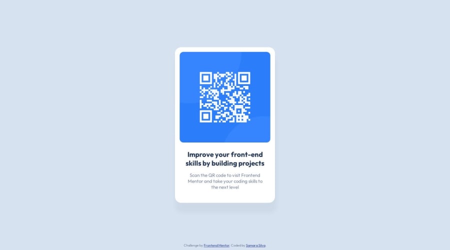
Design comparison
Community feedback
- @mah07308Posted almost 2 years ago
Hello,
Great job completing your first challenge. It looks great on the desktop, but not so good on the mobile because you used
margin: 10rem auto;on yourmain .container.I have a few suggestions to fix that :
-
Add to your main tag
min-height: 100vh;This will center your card without having to add margins. -
Remove from your
main .container:min-height: 45vh; margin: 10rem auto; padding-top: 0px; -
Add to your
main .container:margin: 1rem;
This will make the design look good both on small screens and large screens.
Hope this helps.
Marked as helpful1@samarasilva18Posted almost 2 years ago@mah07308 Thanks so much!! I used your suggestions and the solution looks so much better now! Thanks a lot!
1 -
Please log in to post a comment
Log in with GitHubJoin our Discord community
Join thousands of Frontend Mentor community members taking the challenges, sharing resources, helping each other, and chatting about all things front-end!
Join our Discord
