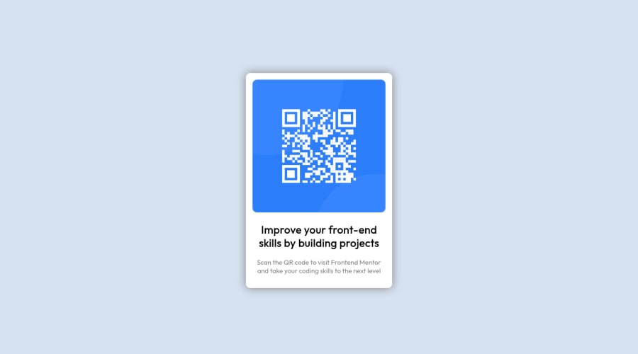
Design comparison
Solution retrospective
- Is there a better option than using 100vh to set the view height of a page?
- Of all things I can't figure out how to bold the text still!
- How to create mobile views? I'm still learning how to adjust HTML to different media!
Community feedback
- @PhoenixDev22Posted about 2 years ago
Hi Jack Padalino,
Congratulation on completing this challenge. Your solution looks great. I have some suggestions regarding your solution if you don’t mind:
- You should use
<main>to wrap the card and the<footer>for the attribution. HTML5 landmark elements are used to improve navigation experience on your site for users of assistive technology.
- Images must have alt attribute. In my opinion, the alternate text should indicate where the Qr code navigate the user : like
QR code to frontend mentor.
- Page should contain
<h1>. In this challenge , as it’s supposed to be a part of a whole page, you may use<h1>visually hidden with class=”sr-only”. You can find it here
- Really important to keep css specificity as low/flat as possible. It’s not recommended to use the ids to target the DOM elements for styling purposes, better to use classes so that it could be more manageable and reusable.IDs have a much higher specificity than classes) IDs have many uses in a webpage aside from being a CSS selector. For example as page anchors, fragment identifiers or to link labels to form fields.
- Adding
rel="noopener"orrel="noreferrer"totarget="_blank"links. When you link to a page on another site usingtarget=”_blank”attribute, you can expose your site to performance and security issues.
Hopefully this feedback helps.
Marked as helpful0 - You should use
- @DavidMorgadePosted about 2 years ago
Hello Jack, welcome to the community and congrats on finishing the challenge! pretty good job in my opinion
I will try to answer your questions as much as I can:
Is there a better option than using 100vh to set the view height of a page?
In this case this is needed to get the component fully centered using flex, you should use
min-height: 100vhinstead ofheight, with height you are forcing the user to have that value, withmin-heightis just the minimum it should have, but can grow.Of all things I can't figure out how to bold the text still!
You need to use the property
font-weight, normally the bold text is atfont-weight: 700orfont-weight: bold, remember that for getting this to work, you have to import the exactly weight from the google fonts!How to create mobile views? I'm still learning how to adjust HTML to different media!
In this project there is no need, just with the
max-widhtis a good to go, for larger projects you will have to use 'media queries'@media, depending on wich type of workflow you are using, you will use@media(max-width: X px)this means that the max-width of the screen for those styles will be the one that you put in your media querie. The other important media querie is@media(min-width: X px)wich means that the styles will start at that breakpoint until the next one!Hope my feedback helps you, if you have any questions don't hesitate to ask!
Marked as helpful0 - @JonyangoPosted about 2 years ago
Hello Jack. Your solution looks good and is actually responsive on mobile screens. I will try to answer some of the questions you have raised.
- How to bolden a text.
- There are a couple of ways to bolden a text. You could use the
<b>tag in HTML to make the text contained in the tag bold. Another way in which you can bolden a text is through the use of font-weight in CSS. For example,
- There are a couple of ways to bolden a text. You could use the
p{
font-weight:600;
}
The higher the font weight, the bolder the text would be.
- How to create mobile views.
- The web is naturally responsive and has multiple ways to make mobile views. One of the ways you could use is through
media queries. Media queries help specify a behaviour you want to happen at a particular screen size. This article here has a detailed guide on how to use them. - Another way you can achieve mobile views is by using percentages for widths instead of fixed widths. This ensures that the content never overflows in a box and changes sizes accordingly.
I hope this help answer some of your questions.
Marked as helpful0 - How to bolden a text.
- @correlucasPosted about 2 years ago
👾Hello Jack Padalino, congratulations for your first solution! 👋 Welcome to the Frontend Mentor Coding Community!
1.I can see that you're having some issues to setup the Github Pages. In my first days I tried to use Github Pages too but was too hard to setup, doesn't helps if you're a beginner like us.
My advice for you is to use
vercel.comornetlify.comthat are really easier platforms for live sets and totally user-friendly, in a matter of 5min your live site is online. All you need to do is to connect the Github account, import the repository and deploy it. Really fast.2.I saw yout repository and the html structure can be reduced by removing unnecessary divs, all you need is a single
<main>or<div>to keep all the content inside, and nothing more. The ideal structure is thedivand only the image, heading and paragraph.Here’s a minimal html structure for this challenge:
<body>
<main>
<img>
<h1></h1>
<p></p>
</main>
</body>
✌️ I hope this helps you and happy coding!
0
Please log in to post a comment
Log in with GitHubJoin our Discord community
Join thousands of Frontend Mentor community members taking the challenges, sharing resources, helping each other, and chatting about all things front-end!
Join our Discord
