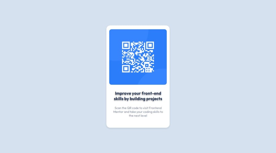
Design comparison
Solution retrospective
I'm particularly proud of accurately replicating the Figma design into a functional web application, mastering responsive design, and using CSS techniques like text shadows. This project improved my skills in detailed layout management, responsive adaptations, and problem-solving, enhancing my capability to deliver high-quality, aesthetically pleasing web solutions
What challenges did you encounter, and how did you overcome them?The challenge I faced was aligning all the divs and paragraphs correctly inside the container to match the Figma design. It took careful adjustments of padding, margin, and flexbox settings to get everything just right, especially for different screen sizes. This work helped me improve my skills in CSS and responsive design
What specific areas of your project would you like help with?In my QR code project, I'm looking for guidance in key areas of needing help ensuring the design is responsive and displays correctly across different devices. I also seek advice on best practices in CSS for more efficient coding and layout management.
Community feedback
Please log in to post a comment
Log in with GitHubJoin our Discord community
Join thousands of Frontend Mentor community members taking the challenges, sharing resources, helping each other, and chatting about all things front-end!
Join our Discord
