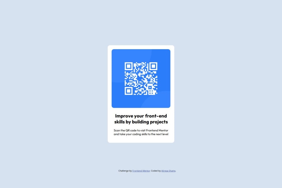
Design comparison
Community feedback
- @Islandstone89Posted 27 days ago
Hi, congratulations on finishing this challenge!
Here is my feedback:
HTML:
-
Every webpage needs a
<main>that wraps all of the content, except for<header>andfooter>. This is vital for accessibility, as it helps screen readers identify a page's "main" section. Wrap the card in a<main>. -
The image has meaning, so it must have proper alt text. Write something short and descriptive, without including words like "image" or "photo". Screen readers start announcing images with "image", so an alt text of "image of qr code" would be read like this: "image, image of qr code". The alt text must also say where it leads(the frontendmentor website). A good alt text would be "QR code leading to the Frontend Mentor website."
-
.attributionshould be a<footer>, and you should use<p>for the text inside. The footer must be outside of the main.
CSS:
-
It is best practice to write CSS in a separate file, often called
style.css. Create one in the same folder as theindex.html, and link to it in the<head>:<link rel="stylesheet" href="style.css">. -
Including a CSS Reset at the top is good practice.
-
Remember to specify a fallback font:
font-family: 'Outfit',sans-serif; -
You only need to set
font-familyon thebody, as its children inherit the value. -
I recommend adding a bit of
padding, for example16px, on thebody, to ensure the card doesn't touch the edges on small screens. -
Remove all
positionandtransformproperties, they are not needed. -
To center the card horizontally and vertically, with space between the main and the footer, I would use Flexbox on the body:
display: flex; flex-direction: column; justify-content: center; align-items: center; min-height: 100svh; gap: 2rem;-
Remove the
widthinpxon the card. We rarely want to give a component a fixed size, as we want it to grow and shrink according to the screen size. -
We do want to limit the width of the card, so it doesn't get too wide on larger screens. To solve this issue, give the card a
max-widthof around20rem. -
font-sizemust never be in px. This is a big accessibility issue, as it prevents the font size from scaling with the user's default setting in the browser. Use rem instead. -
Paragraphs have a default value of
font-weight: 400, so there is no need to declare it. -
Since all of the text should be centered, you only need to set
text-align: centeron the body, and remove it elsewhere. The children will inherit the value. -
On the image, add
display: blockand changewidthtomax-width: 100%- the max-width prevents it from overflowing its container. Without this, an image would overflow if its intrinsic size is wider than the container.max-width: 100%makes the image shrink to fit inside its container.
Marked as helpful0@ali-reza-2531Posted 26 days ago@Islandstone89 Hi, "Thank you so much for taking the time to provide such a detailed and educational review of my code. Your feedback was incredibly valuable, especially in areas I hadn't considered before.
I particularly appreciated how you explained the reasoning behind each suggestion – like why the <main> tag is crucial for accessibility and how screen readers actually process alt text. These insights about accessibility will definitely improve my future projects.
Your CSS recommendations were eye-opening, especially regarding the use of rem instead of px for font sizes and why fixed widths should be avoided in favor of more flexible solutions. I hadn't realized the importance of these choices for accessibility and responsiveness.
The flexbox solution you provided for centering content was much cleaner than my original approach with position and transform. I also learned a lot about CSS inheritance from your explanations about setting properties on the body element.
Thank you for making this a learning opportunity rather than just pointing out issues. Your explanations have helped me understand not just what to change, but why those changes matter.
I would be grateful if you could review my future submissions as well. Your constructive feedback and thorough explanations have been invaluable in helping me grow as a developer, and I’d love to continue learning through your insights.
Best regards, Alireza"
1@Islandstone89Posted 26 days ago@ali-reza-2531 glad to hear that, I'm happy to help 🙂 I would implement my suggestions and update your repository, as applying the changes is just as important as getting the feedback. You don't need to re-upload the solution here on Frontend Mentor, as it is connected to your repository 🙂
Marked as helpful1 -
Please log in to post a comment
Log in with GitHubJoin our Discord community
Join thousands of Frontend Mentor community members taking the challenges, sharing resources, helping each other, and chatting about all things front-end!
Join our Discord
