Not Found
Not Found
Not Found
Not Found
Not Found
Not Found
Not Found
Not Found
Not Found
Not Found
Not Found
Not Found
Not Found
Not Found
Not Found
Not Found
Not Found
Not Found
Not Found
Not Found

Submitted

QR Code Component Challenge

karlkodes 20

@karlkodes

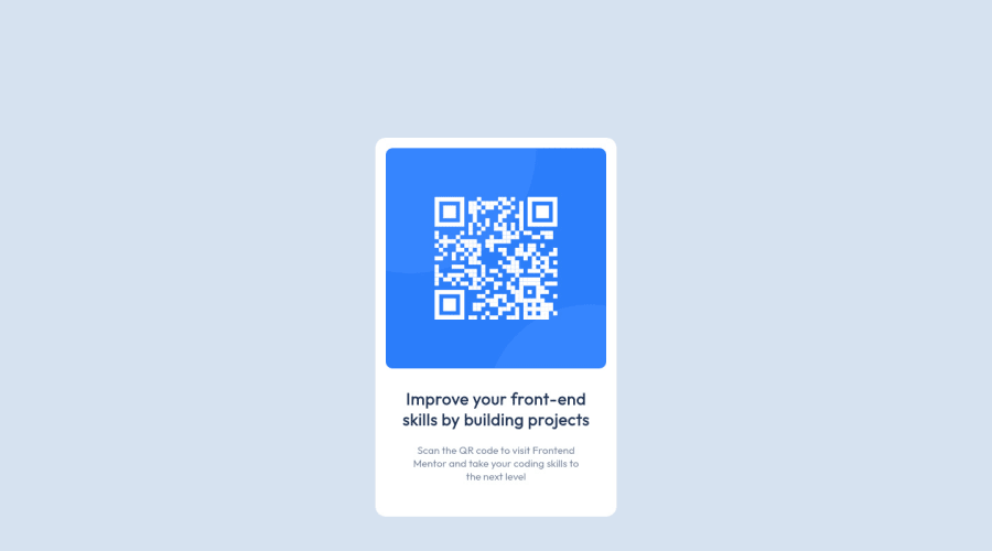
Desktop design screenshot for the QR code component coding challenge

This is a solution for...

  • HTML
  • CSS
1newbie
View challenge

Design comparison


SolutionDesign

Solution retrospective


Any feedback please. Not sure if I did it properly? I did a lot of trial and error to get it as close as possible

Community feedback

@HugoPadilla

Posted

Great job!

If you need a reference you can see my solution here : https://www.frontendmentor.io/solutions/qr-code-component-using-html-and-csssass-GtiN3jg4T

Marked as helpful

1

karlkodes 20

@karlkodes

Posted

@HugoPadilla Just saw your solution and you did great as well. My question is how did you have get the scale so close, i.e. the size of the white box? Was it a matter of calculation based on the resolution of the reference? Thanks!

0

@HugoPadilla

Posted

@karlkodes That's an interesting question!

Basically I use as references the absolute size of the paragraph and the other element I use measures relative to this size to keep the proportion.

Thanks that in the challenge they provide us style-guide.md where we can find the absolute measure in the body copy for the font size of the paragraph: font-size: 15px. I take as a reference the size of this element to adjust the size of the other neighboring elements. To achieve this I use relative units like rem and em. You can learn more about relative units here

I share some recommendations that can help you:

  • Using the display: inline-flex property on the card allows the width and height to be produced by the width, height, padding and margin of the child elements.
  • For text I provide units relative to the width property and try to find the appropriate value that makes it look similar to the reference layout. You can also play with the text line spacing and spacing.
  • From here I can use properties like padding and margin on the elements to separate them as well as possible (I also try to use relative units here).

In the end the size of the card is driven by the size, margins and spacing of the elements inside it.

If you want to know more about rem and em and their differences I leave you this article that can help you:

  1. Comprehensive Guide: When to Use Em vs. Rem
  2. Responsive Typography: rem, em, and px
0

Please log in to post a comment

Log in with GitHub
Discord logo

Join our Discord community

Join thousands of Frontend Mentor community members taking the challenges, sharing resources, helping each other, and chatting about all things front-end!

Join our Discord