Design comparison
Solution retrospective
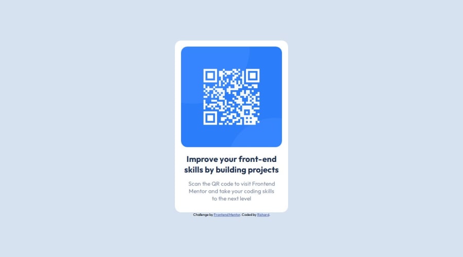
I think having to get the size of the card as well and have it positioned correctly is something i am quite proud of as this was where i spent the most of my time in this challenge.
If i had to do it differently, I think i would not try to overcomplicate things by adding so much unecessary code (eg. Adding min/max-width)
What challenges did you encounter, and how did you overcome them?The main challenge for me was trying to get the card size to match the design spec that was given. Just have to keep doing a trial and error until it looks as similar as possible.
Also had some issue trying to center my card. I realized that i didn't actually need to put a max-width as that skews the position of the card to the left side.
What specific areas of your project would you like help with?I would like to receive your constructive feedback on where i can improve upon on this challenge so that i can get a better insight as well as learn on ways that can help to make it better.
Community feedback
Please log in to post a comment
Log in with GitHubJoin our Discord community
Join thousands of Frontend Mentor community members taking the challenges, sharing resources, helping each other, and chatting about all things front-end!
Join our Discord
