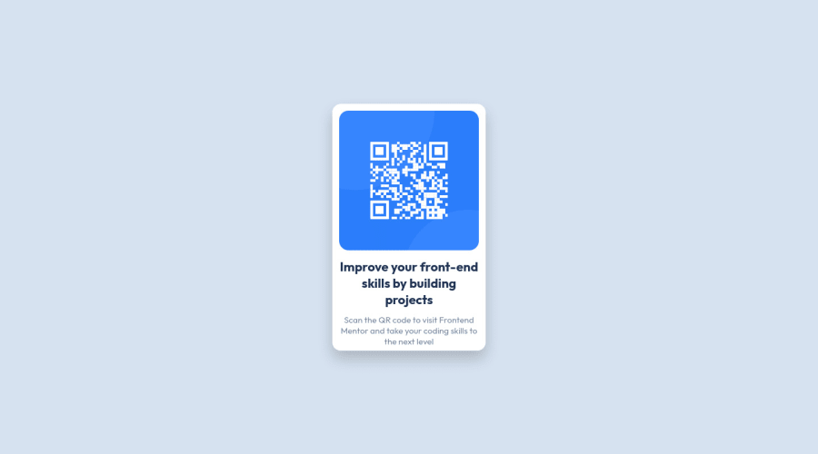
Design comparison
Solution retrospective
I'm very new to HTML and CSS and this was my first challenge outside of the course I've been taking on Udemy. So it took me a while to figure out where to begin and how to make everything look the way I wanted it to.
I had to take a break from this challenge as I got stuck fairly quickly. After returning I managed to change quite a bit. And though it's flawed, and not quite finished, I'm still proud of what I managed to do so far.
Feel free to tell me if there's things I should take another look at or if I should do certain things differently. Like I said, I'm very new to this and would rather learn to do things correctly now instead of in a couple of months!
Community feedback
- @ADCByDefaultPosted almost 3 years ago
Great job ;) i suggest you to search for "Kevin Powell" on YouTube, he makes great videos (mainly css) also for newcomers.
1 - P@12KentosPosted almost 3 years ago
Hey @00-A-00,
Nice job on the project, it looks great!
I looked through your css file and noticed you selected some elements directly like so.
p { color: hsl(220, 15%, 55%); font-weight: 400; text-align: center; }While this is fine for a small project like this, I would highly advise against doing this, as it Will create a LOT of headache for you in bigger projects.
Instead I would suggest you select everything either using classes, or classes and then the element like so.
.text p { color: hsl(220, 15%, 55%); font-weight: 400; text-align: center; }That way only the paragraph elements inside of the element with the class of
textwill be selected rather than every single paragraph element on your page.Keep up the great work, and pretty soon you will see things becoming easier, and easier!
0
Please log in to post a comment
Log in with GitHubJoin our Discord community
Join thousands of Frontend Mentor community members taking the challenges, sharing resources, helping each other, and chatting about all things front-end!
Join our Discord
