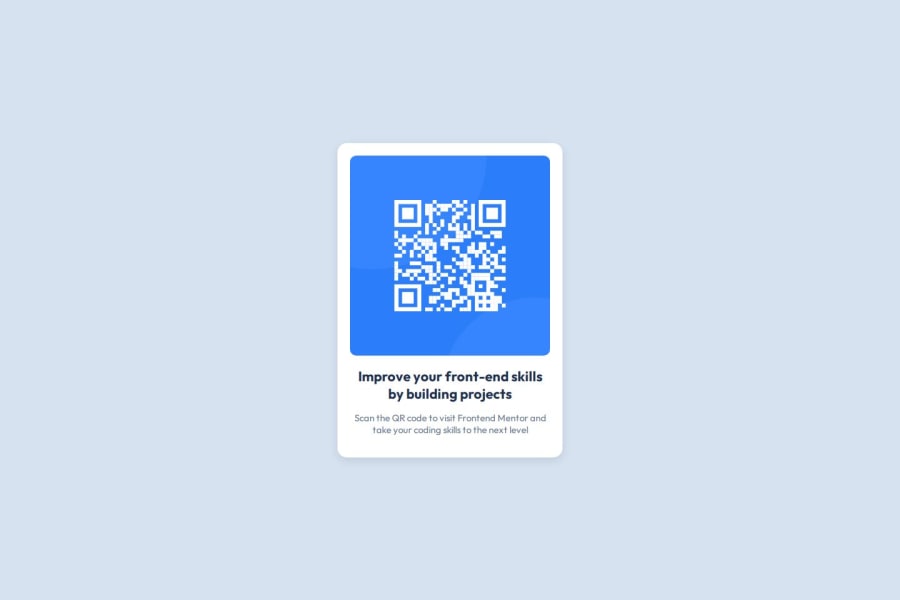


Design comparison

Solution retrospective
I'm proud of creating a clean and simple design for the QR code component, focusing on minimalism while ensuring the layout was responsive across different screen sizes. I also enjoyed using Flexbox for layout, which made centering and positioning elements much easier.
What challenges did you encounter, and how did you overcome them?For this QR Code Component project, the main challenges I encountered were ensuring the layout was responsive across different devices and making the design simple yet effective. To overcome the responsive issue, I focused on using Flexbox for better alignment and positioning of elements. I also spent extra time testing the component on different screen sizes to ensure a smooth user experience. The challenge of simplicity in design was tackled by sticking to a minimalist approach and avoiding unnecessary elements, focusing solely on the QR code and its surrounding layout.
What specific areas of your project would you like help with?CSS Structure and Efficiency: I’d like suggestions on how to organize my CSS more efficiently, especially for responsiveness. Are there any best practices for keeping stylesheets clean and minimizing redundancy?
Community feedback
- @DangelobastPosted about 2 months ago
Keep it up !
- Once you get comfortable start using responsive units, avoid using px since it can complicate your life when doing responsive.
- Do a global reset, something most people do automatically when starting CSS rules. *{ margin:0 padding:0 box-sizing:border-box;} That way you ensure there is no extra padding or margins applied to elements as well as changing how width and height are calculated, if you don't use border-box you if you set a box to 20px and padding to 2px, in reality, your box is not exactly 20px, and you will have to add that padding too, with border box it's already included and it's "forced" to be 20px, search some info about it. and * selector is just to select every single element
0 - P@SKszymekPosted about 2 months ago
When you gives some element fixed width you should always use the max-width property, not width. Go check how the element behaves after changing width with max-width on the different screen sizes.
0


Please log in to post a comment
Log in with GitHub
Join our Discord community
Join thousands of Frontend Mentor community members taking the challenges, sharing resources, helping each other, and chatting about all things front-end!
Join our Discord