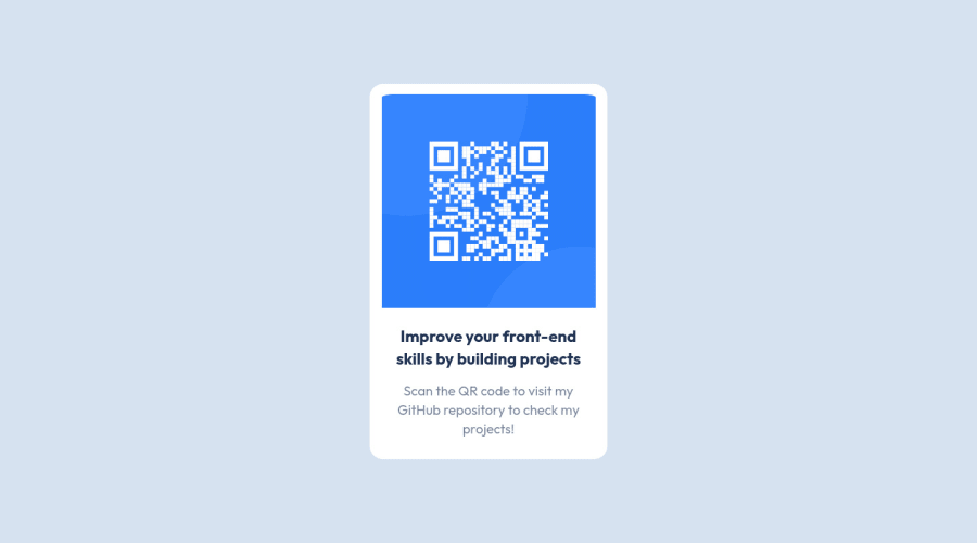
QR code component challenge build with ReactJS
Design comparison
Solution retrospective
All feedback is appreciated :)
Community feedback
- @alvin-devPosted about 3 years ago
Nice work man. You forget the border-radius on image.
Marked as helpful0@alihuseynzade23Posted about 3 years ago@alvin-dev I tried to use border radius, but it doesn't work. Maybe because I'm sitting in the Firefox. When I did component like this before in Google Chrome it worked properly.
0 - @rsrclabPosted about 3 years ago
Hi, @AleksHNZ ~
Congratulate on your solution to the challenge on FM platform. I have studied your work carefully and learned a lot from it.
Here are some of the tips I like to provide.
- Please try BEM for naming element classes. It will help you a lot on bigger projects.
- Image tags must have alt attribute as a standard.
If it can help you even a bit, it would be happy to me.
Cheers ~
Marked as helpful0 - Account deleted
Nice work @AleksHNZ 👋
Your design is awesome 😊. One very little detail that decreases description text by 2-4 pixels. They leek a bit high compared to the design
Cheers Maqsud
Marked as helpful0
Please log in to post a comment
Log in with GitHubJoin our Discord community
Join thousands of Frontend Mentor community members taking the challenges, sharing resources, helping each other, and chatting about all things front-end!
Join our Discord
