Design comparison
SolutionDesign
Community feedback
- @Grego14Posted 11 months ago
Hello! 🎉 Congratulations on completing the challenge! 🎉
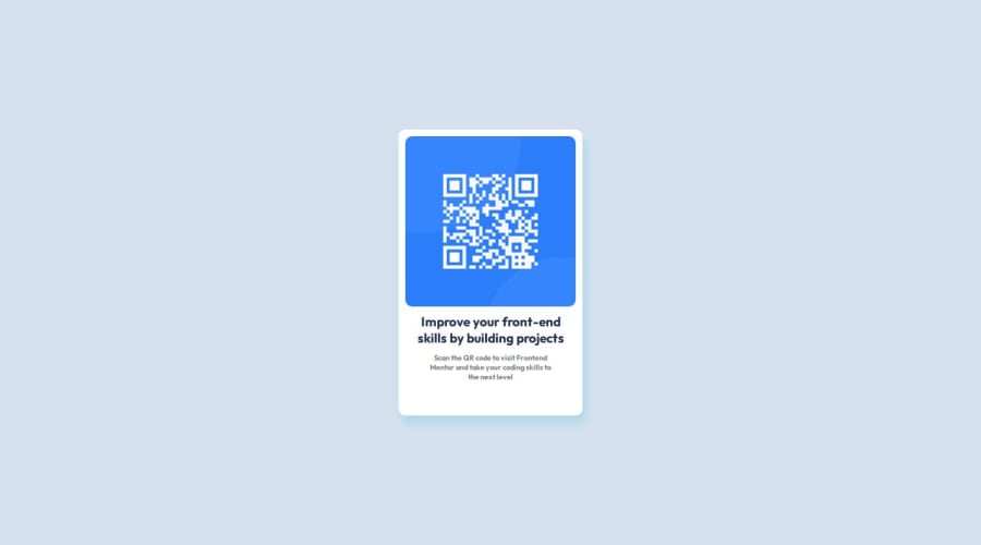
Remember not to skip the headings, you should use a h1 instead of a h4.
Replace that h6 with a p to make the text more semantic.
Since you're not adding an alt attribute with description, you can use the aria-hidden attribute to hide the image from the accessibility tree.
Hope this helps! 😁
Marked as helpful1
Please log in to post a comment
Log in with GitHubJoin our Discord community
Join thousands of Frontend Mentor community members taking the challenges, sharing resources, helping each other, and chatting about all things front-end!
Join our Discord
