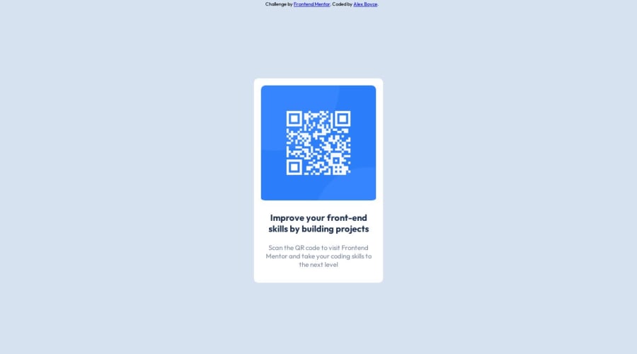
Design comparison
SolutionDesign
Solution retrospective
I noticed there were mobile size specifications, but in my code I didn't write anything explicit for a smaller device (besides limiting the scale of elements), is there anything I should be aware of when creating for multiple devices?
Community feedback
- @Aedan5621Posted about 1 year ago
check this video to learn about the CSS Media Queries (https://youtu.be/2KL-z9A56SQ)
Marked as helpful1@GrowingHermit44Posted about 1 year ago@Aedan5621 Thanks, I knew I was missing something but didn't know what. Going to use that moving forward. Thanks again.
0
Please log in to post a comment
Log in with GitHubJoin our Discord community
Join thousands of Frontend Mentor community members taking the challenges, sharing resources, helping each other, and chatting about all things front-end!
Join our Discord
