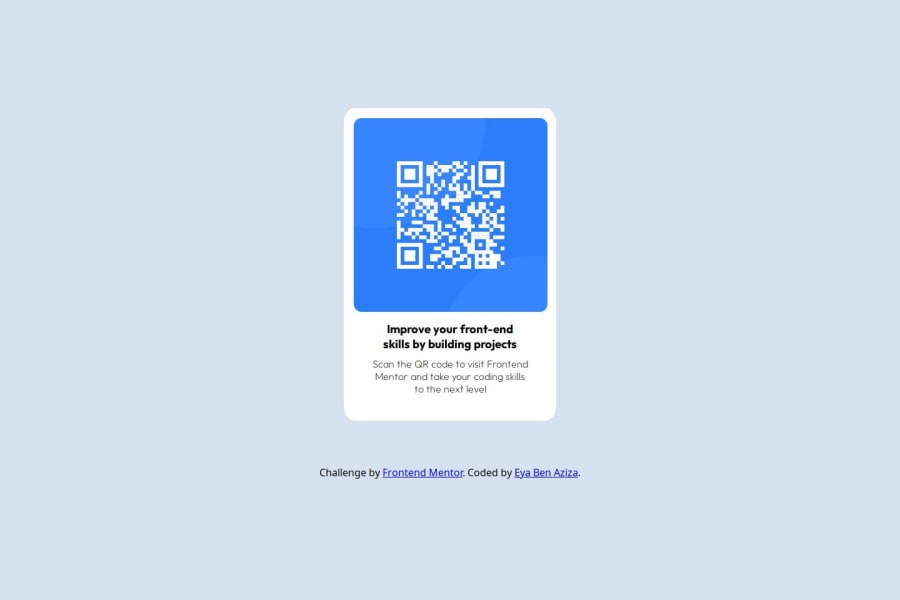
Design comparison
Solution retrospective
I am proud that I delivered a result that is most likely identical to the design given. if it's not the case please let me know for next projects, I would use other ways to position my element in the center. this time I used margin-top and margin-left properties but I am sure it's not the best way to do it as I tried multiples values to get the right position.
What challenges did you encounter, and how did you overcome them?the project is simple but I had two major challenges: 1- how to center the block element , so I used "transform" property transform: translateX(-50%);
2-how to add responsiveness (I am new to it): so I used media queries I am sure that the responsiveness is not perfect so a feedback on this would help
What specific areas of your project would you like help with?I would like some help with the responsiveness part and thanks for your time.
Community feedback
Please log in to post a comment
Log in with GitHubJoin our Discord community
Join thousands of Frontend Mentor community members taking the challenges, sharing resources, helping each other, and chatting about all things front-end!
Join our Discord
