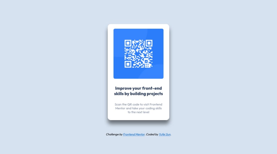
Design comparison
Solution retrospective
Hi there! ๐คI'm Yufei, and this is my solution for a challenge created by Frontendmentor. Since I'm new to HTML and CSS, this project is a good opportunity to practice them. The main challenge of this project is to build out this QR code component and get it look as close to the design as possible. The users should be able to view the optimal layout depending on their device's screen size. Built with
- Semantic HTML5 Markup
- CSS custom properties
- Flexbox
- Desktop-first workflow
Community feedback
- @Mohit-k-MummonPosted almost 2 years ago
Hey so If you want to make your websites responsive you'll want to utilize Media Queries
Do some research on media queries and then you'll want to start with a mobile first approach when building a website. It is much easier to build the mobile site and then add media queries for tablet and desktop sizes. Take a look at some of my projects source code for some examples.
As for the tool you can use the browser's built in dev tools, it will allow you to see what your website will look like at various screen sizes
Marked as helpful1 - @MelvinAguilarPosted almost 2 years ago
Hello there ๐. Good job on completing the challenge !
I have some suggestions about your code that might interest you.
HTML ๐:
- Use the
<footer>
tag to wrap the footer of the page instead of the<div class="attribution">
. The<footer>
element contains information about the author of the page, the copyright, and other legal information.
Alt text ๐ท:
- The
alt
attribute should not contain the words "image", "photo", or "picture", because the image tag already conveys that information.
-
The
alt
attribute should explain the purpose of the image. Uppon scanning the QR code, the user will be redirected to the frontendmentor.io website, so a betteralt
attribute would beQR code to frontendmentor.io
If you want to learn more about the
alt
attribute, you can read this article. ๐.
CSS ๐จ:
- This solution is well done because it adapts to mobile devices without needing to use media query, in bigger challenges you can try using mobile-first approach to make your projects mobile friendly.
- There is a typographical error, you wrote
desplay: flex;
instead ofdisplay: flex
which makes the properties for the flex layout not apply, however, the solution remains so all those styles are unnecessary.
main { /* display: flex; */ /* justify-content: center; */ /* align-items: center; */ background-color: white; max-width: 320px; /* height: auto; */ box-shadow: 0 20px 20px 0 rgb(0 0 0 / 50%); margin: 2rem; padding: 1rem; border-radius: 1rem; }
- Most modern web browsers come with built-in developer tools called DevTools that allow you to see how a website will look on different devices.
I hope you find it useful! ๐ Above all, the solution you submitted is great!
Happy coding!
Marked as helpful0@Siwi0w0Posted almost 2 years ago@MelvinAguilar Thank you Melvin, these suggestions help a lot! Have a nice day โบ๏ธ
0 - Use the
Please log in to post a comment
Log in with GitHubJoin our Discord community
Join thousands of Frontend Mentor community members taking the challenges, sharing resources, helping each other, and chatting about all things front-end!
Join our Discord