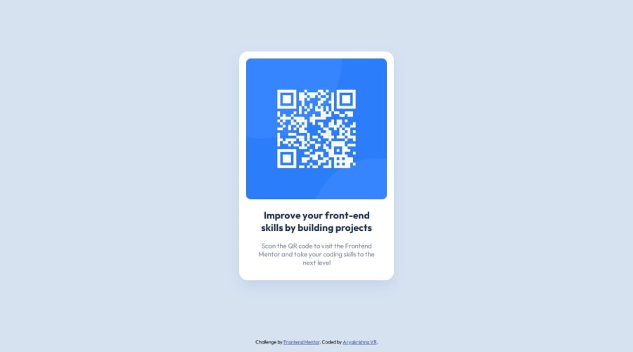


Design comparison

Solution retrospective
I am able to design a responsive component. Since i used to design web pages using CSS libraries, I forgot most of the CSS properties but i could recall it.
Next time i wish to use CSS without any other resources
What challenges did you encounter, and how did you overcome them?i didn't faced any challenges.
What specific areas of your project would you like help with?- Responsive design
Community feedback
- Account deleted
Hello, aryakrishnaksh2021. Congrats on completing the challenge!
I have some suggestions that might be helpful to you in the future:
- Consider using the
maintag to represent the main content of your page, which, in this case, is the card. - Instead of adding
<section class="container">and<div class="row">to center your content, you can use these two methods:
/* Add this to your body selector */ body { min-height: 100vh; display: flex; justify-content: center; align-items: center; } /* _ _ _ OR _ _ _ */ /* Add this to your main selector */ .card { /* other styles */ position: absolute; top: 50%; left: 50%; transform: translate(-50%, -50%); }- To ensure that the image stays inside the card, no matter the size, add
width: 100%to your.card-imgselector. - Adding the
backgroundproperty inside yourbodyselector is best.
Regarding responsiveness, you may find
width: min()useful to resize the content depending on the screen size. You can read more about it here => MDN: CSS min()I hope you find these suggestions helpful. With that, happy coding!
0 - Consider using the
- P@merwhite11Posted 12 months ago
Great work @aryakrishnaksh2021 !
I'm impressed you were able to get the font sizes and line breaks to match the model!
One thing I would recommend is using flex on the card itself (you wouldn't need the row div in this case). That way you won't have to hard code in the widths of the card. The width will be determined by the fixed width of the qr-code image + margins + padding. It will fill the entire screen for small screens.
Another tool I'm learning and trying to work with now is BEM and nesting with scss to make styling more readable. Maybe something to try for the next project ! -- https://getbem.com/introduction/ https://medium.com/swlh/sass-bem-nesting-variables-970403f42dd6
0

Please log in to post a comment
Log in with GitHub
Join our Discord community
Join thousands of Frontend Mentor community members taking the challenges, sharing resources, helping each other, and chatting about all things front-end!
Join our Discord