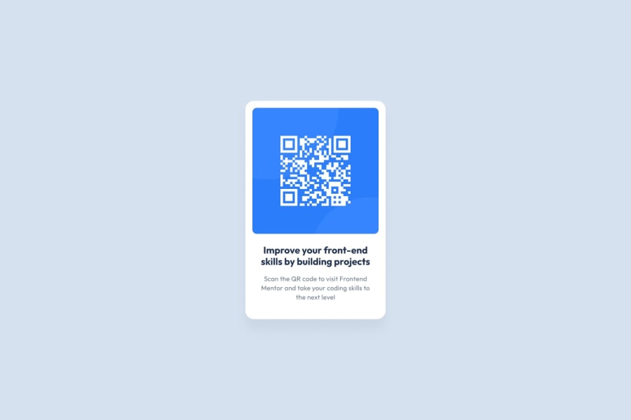
Design comparison
Solution retrospective
I'm not particularly proud of my work on this project, but the result is quite close I think.
What challenges did you encounter, and how did you overcome them?I tried several times to get the paddings for the text that it was be the same as the design. I had to go over it again and again, even though I could see which ones to work on.
What specific areas of your project would you like help with?- Is the CSS properly organized?
- And have I correctly broken down my HTML code (div, class, ...)?
- Thank you!
Community feedback
- @grace-snowPosted about 1 month ago
A few more pointers
- make sure the card can't touch screen edges. Just give the body a little padding (e.g. 15px)
- This challenge is for a single card. We build component demos like this but it's not a full web page so you need to consider the context of the component (make it so it could be dropped into a real page). It's great that you used a h2 because this card would never serve the main page heading. BUT you have currently made the whole card into a
main
landmark and that's bad because you would never nest landmarks inside each other like that. This card needs to be an element inside the main landmark, not be the main landmark. - Remove the fixed position footer as it's overlapping the card sometimes. There's no reason to position it, just let it sit below the card.
- Don't forget about the small details like the paragraph colour.
- Place the reset at the start of the styles instead of loading a whole extra stylesheet.
Marked as helpful2@ErwiniaDevPosted 22 days ago@grace-snow Thanks so much for all the feedback! It's really helpful!
0 - @StroudyPosted about 1 month ago
Exceptional work! You’re showing great skill here. I’ve got a couple of minor suggestions that could make this stand out even more…
-
Using a full modern CSS reset is beneficial because it removes default browser styling, creating a consistent starting point for your design across all browsers. It helps avoid unexpected layout issues and makes your styles more predictable, ensuring a uniform appearance on different devices and platforms, check out this site for a Full modern reset
-
While
px
is useful for precise, fixed sizing, such asborder-width
,border-radius
,inline-padding
, and<img>
sizes, it has limitations. Pixels don't scale well with user settings or adapt to different devices, which can negatively impact accessibility and responsiveness. For example, usingpx
for font sizes can make text harder to read on some screens, Check this article why font-size must NEVER be in pixels. In contrast, relative units likerem
and adjust based on the user’s preferences and device settings, making your design more flexible and accessible. Usepx
where exact sizing is needed, but prefer relative units for scalable layouts. If you want a deeper explanation watch this video by Kevin Powell CSS em and rem explained. Another great resource I found useful is this px to rem converter based on the default font-size of 16 pixel. -
For future project, You could download and host your own fonts using
@font-face
improves website performance by reducing external requests, provides more control over font usage, ensures consistency across browsers, enhances offline availability, and avoids potential issues if third-party font services become unavailable. Place to get .woff2 fonts
I hope you’re finding this guidance useful! Keep refining your skills and tackling new challenges with confidence. You’re making great progress—stay motivated and keep coding with enthusiasm! 💻
Marked as helpful1 -
- @Fable54321Posted about 1 month ago
So, at first glance, the difference between your solution and the design seems to come from your image being bigger.
Looking at your code I am not sure what causes it exactly. Did you get it directly from the assets directory given with the starter code?
If you did, I recommend you always get your image first without touching any height or width adjustment. A lot of the time if an image is given to you, it will already be the right size.
Apart from that, I think that you are maybe a 100pts too bold on both your font-weights, but I think I did the same for some reason.
If not from these, your project looks really good. HTML looks good too.
1@ErwiniaDevPosted 22 days ago@Fable54321 Thank you for taking the time to give me this feedback! Yes, I did take the downloadable elements initially, and went from there. I've made a few corrections that other people have pointed out, so it should be much better.
0
Please log in to post a comment
Log in with GitHubJoin our Discord community
Join thousands of Frontend Mentor community members taking the challenges, sharing resources, helping each other, and chatting about all things front-end!
Join our Discord