

Design comparison

Solution retrospective
Thank you for any feedback.
Community feedback
- @solvmanPosted 10 months ago
Very well done! 🎊🎉🚀
I have a few suggestions for you:
-
⭐️ Great job using semantic element
<main>. Semantic elements significantly improve the SEO and accessibility of your project. First, the<main>landmark element represents the primary content of the document and expands on the central topic of the document. You should wrap your content in<main>.Such widgets as cards are more suited to be constructed with the<article>element, which encapsulates reusable, self-contained content. However, the<seciton>element is unnecessary since it has no semantic significance. -
⭐️ Titles and headings are usually denoted by
<h1>,<h2>,<h3>, and so on. Do not skip levels of headings. Regular text is generally encapsulated by<p>.A card-like widget's most appropriate heading level is likely<h2>.
With that being said, I would redo your code as so:
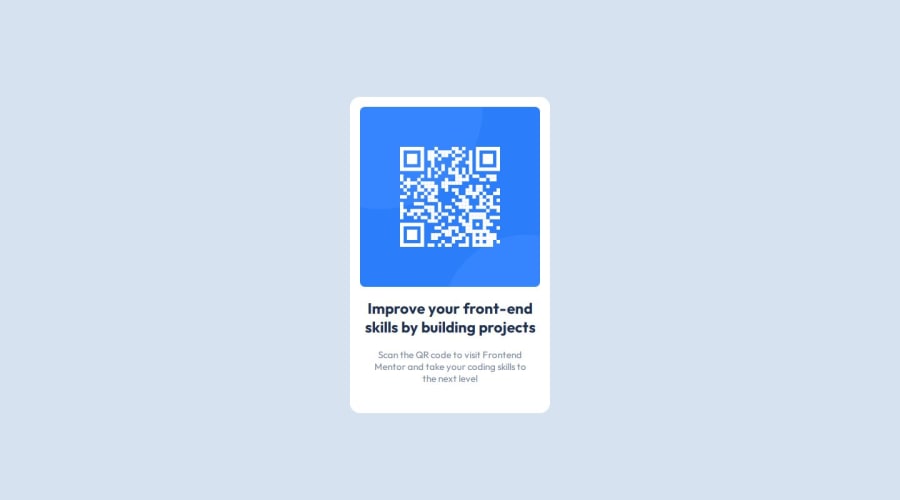
<body>
  <main id="container">
    <h1 class="visually-hidden">Frontend Mentor project submission</h1>
    <article class="card">
      <img src="./images/image-qr-code.png" alt="QR Code">
      <h2>Improve your front-end skills by building projects</h3>
      <p>Scan the QR code to visit Frontend Mentor and take your coding skills to the next level</p>
    </article>
  </main>
  <footer class="attribution">
      ... attribution goes here
  </footer>
</body>
As mentioned above, the
<h2>heading is the most appropriate for the card-like widget. To avoid breaking hierarchy heading rules, I added an invisible<h1>heading to announce "Frontend mentor project submission" to accessibility users. Visually hidden class (it is also calledsr-onlywhich is "screen reader only") for the<h1>:.visually-hidden { position: absolute; width: 1px; height: 1px; padding: 0; margin: -1px; overflow: hidden; clip: rect(0, 0, 0, 0); white-space: nowrap; border: 0; }Learn more about semantic HTML elements here
Please remember that block-level elements stack one on top of the other. The only element that is not block level within the card is
<img>,which could be "converted" to block level through a simple reset, which should be used almost on every project anyways:img { display: block; max-width: 100%; /* ensures images does not overflow the container */ }-
⭐️ The reset above will ensure the images stretch to fit the containing element. There is no need to set the image size; doing so makes the image not responsive to viewport resizing.
-
⭐️ Great job using Grid to place your card in the middle of the screen. 👍
-
⭐️ Be consistent using REM units for margin, padding, and font size. 👍
-
⭐️ Great use of custom global variables. 👍
Otherwise, very well done!🎊 Keep it up!👏 I hope you find my comments useful 🫶
Marked as helpful1@gab-holikPosted 10 months ago@solvman Thank you so much for the feedback and for the tips I really appreciate it.
1 -
- @cchiversPosted 10 months ago
Looks really good, I would drop the
font-weightof the heading. Other than that it looks amazing. Keep up the great work!Marked as helpful1@gab-holikPosted 10 months ago@cchivers thanks for the feedback. You are right, for some reason I thought the heading was smaller than it should be.
0


Please log in to post a comment
Log in with GitHub
Join our Discord community
Join thousands of Frontend Mentor community members taking the challenges, sharing resources, helping each other, and chatting about all things front-end!
Join our Discord