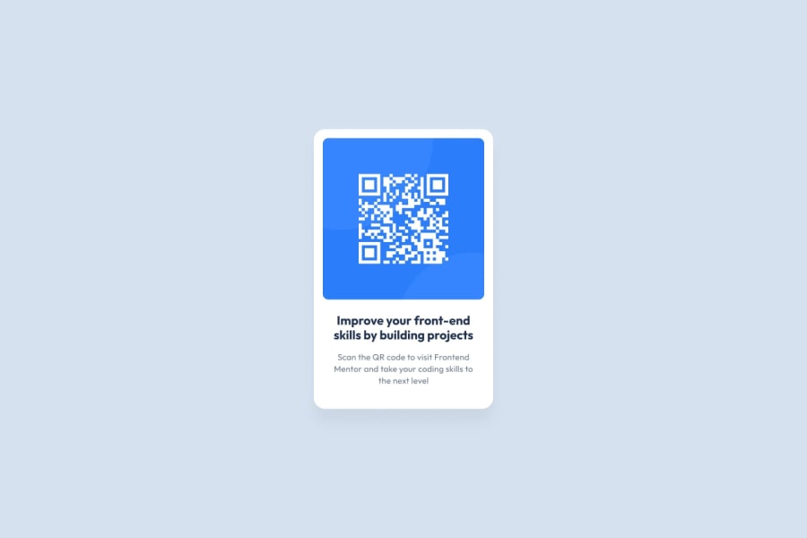
Design comparison
SolutionDesign
Solution retrospective
All Feedback is welcome Thank you in advance
Community feedback
- @mecha-mannPosted over 1 year ago
Congrats. I have 2 suggestions.
- The card is really big, maybe you can shrink it down a bit to match with the reference image.
- There isn't much contrast between the paragraph color and the background making it hard to read. Maybe you can darken the paragraph's color a bit. Just like the reference.
Everything else looks good.
0@iamrahulkotaPosted over 1 year ago@mecha-mann Thanks buddy, for helping out ! I knew the 1st point but your 2nd point is really good.
1
Please log in to post a comment
Log in with GitHubJoin our Discord community
Join thousands of Frontend Mentor community members taking the challenges, sharing resources, helping each other, and chatting about all things front-end!
Join our Discord
