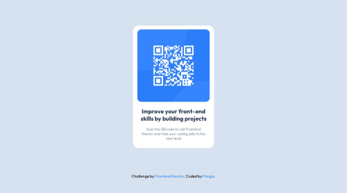
Design comparison
SolutionDesign
Solution retrospective
Challenge #1 completed, tho I suspect there might be some responsive issues regarding height. Open to any tips.
Community feedback
- @gfunk77Posted about 1 year ago
Nice job on the QR code. I’d suggest a few things:
- use
min-height: 100vh
on your container. This will keep you card from cutting off on small screens. - try putting your image at
max-width: 100%
- on desc try using
text-align: center
to center the text instead of margins.
I hope this is helpful or at least goffers some stuff to try out. Your solutions looks great. Congratulations
Marked as helpful1@pmigixPosted about 1 year agoThank you, @gfunk77! I've taken your suggestions into consideration and implemented some changes.
0@SkAliyaPosted about 1 year ago@pmigix hey hi, can you tell me how u inserted screenshot in readme.md file! thanks in advance😊
0 - use
Please log in to post a comment
Log in with GitHubJoin our Discord community
Join thousands of Frontend Mentor community members taking the challenges, sharing resources, helping each other, and chatting about all things front-end!
Join our Discord