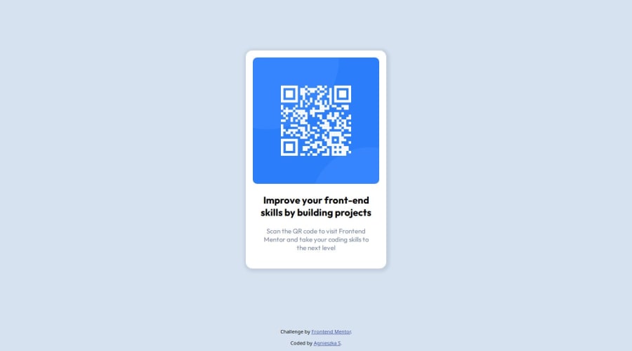
Design comparison
Solution retrospective
In this project I mostly used the margins and padding to match it to the design. In the future I would focus more on other techniques of centering the elements.
What challenges did you encounter, and how did you overcome them?I tried a few methods to keep the footer at the bottom. Finally, I implemented the absolute position.
What specific areas of your project would you like help with?I would appreciate some feedback on placing the footer, as well as best practices for centering elements on the screen, eg. div.
Community feedback
- @FlashdanielPosted 10 months ago
Great work agsendo. You can also use Grid to center elements and also push the footer at the bottom of the page.
Make use of responsive units like em and rem for font size, padding, margin, and width, and use px for places like border, and border-radius. Users can increase their browser font size or zoom their screen and you will want you site to look good and responsive in that case. Read more about responsive unit a post by Dixinta Ganatra
0 - @EFEELEPosted 10 months ago
Use flexbox to center some elements. For example, in your code, you can add this:
Remove the margin-top from your main tag:
And add some properties to your body.
body {
    margin: 0;
    padding: 0;
    background-color: hsl(212, 45%, 89%);


    display: flex;
    justify-content: center;
    align-items: center;
    min-height: 100vh;
}
0
Please log in to post a comment
Log in with GitHubJoin our Discord community
Join thousands of Frontend Mentor community members taking the challenges, sharing resources, helping each other, and chatting about all things front-end!
Join our Discord
