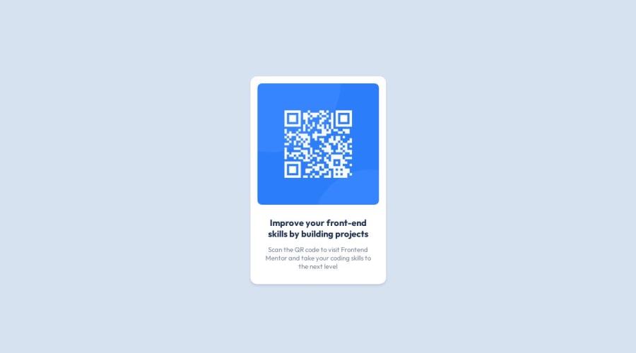
QR Code Component by Watership | Desktop First
Design comparison
Solution retrospective
Hey, I am Watership💧🙋♂️. And this is my solution for theqr code component challenge. 🚀
Goals Accomplished ✅:
- I was able to get better with VueJS and Vanillia CSS🛩️
- I got better with ⭐The Basics⭐
Built With🪄:VueJS✔️Vanilla CSS✔️
Overall, I really liked this challenge, and would appreciate any feedback that's given. ❤️
Watership💧🌊✌️🙋♂️
Community feedback
- @adityaphasuPosted over 1 year ago
Hello, @Hyoaku!
Nice solution! Just some fixes regarding CSS:
- Try using a CSS reset in your projects like this one to remove all the default styles that the browser applies.
- Currently due to no CSS reset the browser adds a little bit of margin to the body and hence you can see that there's this scrollbar on the page.
- Use
min-height:100vhon the body instead ofheight:100vhbecause usingheight:100vhwould cause the content to overflow and might not be fully visible. On the other hand,min-height: 100vhensures that card will always be at least the height of the viewport, but it can expand if the content inside requires more space this prevents content from being cut off or inaccessible. - Instead of giving the
ptags width you can just give the<main>tagwidth: 17remand remove thewidth: fit-contentfrom it. - I see you have used
remunits in most of the properties but not font sizes so try to useremto set font sizes as well so that they scale well if it's a scalable layout. (this card doesn't scale but its good practice to use rem for font sizes)
Apart from these few things good job on the challenge with Vue.js! 🙌🏻 (I also want to try Vue someday haha)
Keep up the hard work and happy coding!😊
Marked as helpful1
Please log in to post a comment
Log in with GitHubJoin our Discord community
Join thousands of Frontend Mentor community members taking the challenges, sharing resources, helping each other, and chatting about all things front-end!
Join our Discord
