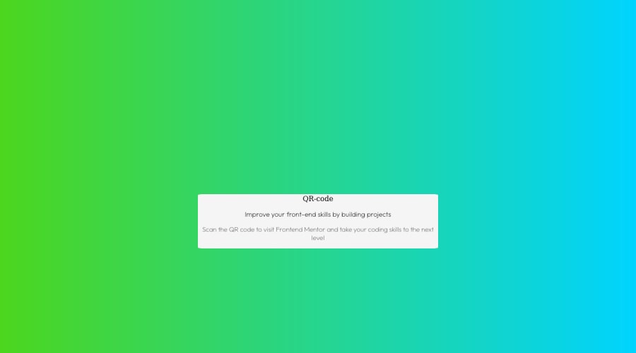
Submitted over 1 year ago
QR Code Component by HTML and CSS using flexbox and Box Technique
@Divyesh172
Design comparison
SolutionDesign
Solution retrospective
I found it difficult to estimate the parameters for the padding and margins while building the project. How can I improve?
Community feedback
- @MarjanZivkovicPosted over 1 year ago
Congrats on your first project! First of all, I can't access your page online. Check what's wrong with the deployment. From looking at your code I can say:
- Never use absolute paths for your files. It works on your machine but it won't work when you deploy your website. So you should replace:
<img src="C:\Users\admin\Desktop\Files\image-qr-code.png" alt="QR-code" width ="200" height ="200" >
with<img src="./image-qr-code.png" alt="QR-code" >
if the image is in the same folder as your index.html. Also, avoid giving img the same width and height if the original image is not in square format. It causes image distortion. Btw, don't forget to also deploy your image with your other files. - Instead of experimenting with giant margins (400px), you should set a max-width on your container ( class='main' ) and make it center on the page with
margin:auto
. Since it's the only child of your body, you can set the body as a flex container withmin-height:100vh
and center everything on the page withjustify-content: center
,align-items:center
. - Use
display:flex
instead of flexbox. Make better use of HTML semantic tags...
Just a few tips. Hope some of this was helpful
0 - Never use absolute paths for your files. It works on your machine but it won't work when you deploy your website. So you should replace:
- @0xabdulkhaliqPosted over 1 year ago
Hello there 👋. Congratulations on successfully completing the challenge! 🎉
- I have other recommendations regarding your code that I believe will be of great interest to you.
CSS 🎨:
- "Difficult to estimate the parameters for the padding and margins while building the project ?", Since the component has not been centered properly. So let me explain, How you can easily center the component without using
margin
orpadding
.
- We don't need to use
margin
andpadding
to center the component both horizontally & vertically. Because usingmargin
orpadding
will not dynamical centers our component at all states
- To properly center the component in the page, you should use
Flexbox
orGrid
layout. You can read more about centering in CSS here 📚.
- For this demonstration we use css
Grid
to center the component.
body { min-height: 100vh; display: grid; place-items: center; }
- Now your component has been properly centered
.
I hope you find this helpful 😄 Above all, the solution you submitted is great !
Happy coding!
0
Please log in to post a comment
Log in with GitHubJoin our Discord community
Join thousands of Frontend Mentor community members taking the challenges, sharing resources, helping each other, and chatting about all things front-end!
Join our Discord